The first test strip was done at an aperture of 4 and times of 2,4,6, and 8 seconds. The image is dark, that is to say, at all of the time intervals, the areas that look like they should be white are a greyish color that only darkens overall as time increases. There are no white bits in the image, and the clarity is also really bad.
Test Strip 2, 3, 4
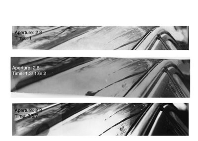
 So for test strip 2, I decided to open the aperture to 2.8 and begin with a time of 1 second. This produced a print that had some white shades but lacked in black shading. It is too fair, but shows promise that with increased time, it will keep its contrast and only the dark areas will darken. I could see this in the white expanse in the lower left hand corner (out of focus) against the dark lines of where the car curves where the window meets the body of the car.
So I increased the time to 1.3, 1.6 and 2 seconds. The 3rd test strip was similar to the second, pale and washed out. But in this case it was worse, because contrast was lost as the time increased. this is shown by the fact that the white expanse that was previously, well light, is now a muddy shade of grey.
With the tip that increasing the time increases the black and whiteness of a shot, I increased the time to 3, 5, and 7 for the 4th test strip. This greatly improved the print. Now there is a large difference between the shades of black and white of the lines slanting out of the picture. The reflection of the clouds is light while the window detailing and the body of the car to the left of the reflection are quite dark. The effect of this is to make the image more balanced. Also, the black and white contrast of the image makes it more clear and visible. And now the glossiness is more perceptible as sleek black lines interrupted by reflections of clouds compose the shot.
Final Print

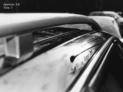
I was pleased with how the final print turned out. This one is at 7 seconds. I had tried another at 8.3 seconds just to see if increasing the time even more would make subtleties clearer (such as the cloud pattern) but it ended up not turning out better, and I chose this 7 second one. The composition is all right. There are diagonals which help to make a photo more interesting and dynamic. Also the sloping action of the top of the car and how the lines seem to run parallel to each other, yet angled out at this perspective is nice. Also the perspective is one not usually seen when you look at a car, so it is unexpected and helps to make the identity not obvious to tell. The foreground and background are out to focus which help to isolate the and highlight the lamp in the reflection as the main focus of the print.


No comments:
Post a Comment