12.15.2006

Lighting (Part III) - Hair P3/Q1: Printing Compositions

Print One: Angle Shot: Ryan

Test Strips 1-4


These four test strips show the print at different apertures. The first test strip is too evenly grey so that the print would seem flat. The second, although way too light to be representative of how it could look still show one shade of grey without definition or promise that the dark places will become defined. No contrast. The third test strip is similar. Although the time seems right, the skin is a greyish color and the parts that should be bolder and more defined are not. Finally, when I tried an aperture of 5.6, the results were much better. Now the collar is a darker, but not at the expense of the skin becoming dark and ashy. Also there is more of a noticable differece between the different intervals as the shades get continually more contrasted rather than simply darkening existing grey shades. Lastly there are bold lines around the eyes and especially the eyebrows that define the face and make it less wishywashy.

Final Print


The final print came out fine. While I usually prefer a darker, bolder print, in this case it somewhat fits to have a lighter print to go with Ryan's personality. His hair is nicely highlighted in the sun in some places and his sweater helps to balance out the image by making it darker and grounding it. I kind of like that his eyes cannot be seen.

Print Two: Two Subjects: Alan and Claudio

I was excited about this print because it presents these two guys just being as they are: both laughing and joking and it's a pretty fun print. Though it did come out a bit dark.

Test Strip 1


This test strip shows a good richness of color around the 8 second range. I think that that aperture is correct (it was taken in the same conditions as the previous one anyways so that would make sense) it is just a matter of finding what time suits Alan, as this focuses only on Claudio.

Test Strip 2>

So the next test strip was done at 8 seconds to see if this worked on Alan's par t of the photo. I think that it was successful as you can see detail in his face, and his hair is dark enough with a few light spots (from the sun?), and his teeth and eyes are light enough. So I decided to proceed with the final print.

Final Print


Somehow the final print came out darker than these two test strips. I reprinted at a later date to get more visibility on the faces of the two as they were too dark. This worked out better than I thought, because their hair still remained a dark shade instead of lightening up and turnign a dark grey like I thought it might. This is the first version, however. It is a shame that I scratched the negative, as the scrape on the front is very noticable and bugs me. Also, from close up there are other specks of white bits that could be done without.

Print Three: Close up: Katrine

This one was by far the easiest print. After trying for a while unsuccessfully to get a print of Anthony to work out, I tried this one at the same settings as the one before and it worked immediately.

Test Strip One


The test strip shows some promising things. Katrine's eyes are really dark, yet her skin is not to0 dark. The most important thing to notice, however, is the hair, since that is the focus of the picture. I was really pleased with how you can see the detail of her hair as far as texture and shading. It looks very shiny and the differences in color make for a very interesting look. I couldn't tell all this from the contact sheet so it is a good thing that I tried it.

Final Print


So I tried a final print to see if it looked okay for the rest of it. I think that it worked out nicely. Although I am not wild about the composition, I think that it is flattering to her waves and shows that she has neat hair. I also think that it is a balanced photo, as the background is very dark and surrounds her on all sides. Also, the contrast is good, but I hope that it is not too overdone.

Lighting (Part III) - Hair P3/Q1: Diary Entry

The final segment of the lighting unit was a project on hair. I tried to use one of the photos from the fashion unit (the one of Gillian, shown below) because I liked the reflection on her hair and also her pose was very fitting for her personality. Unfortunately, most of the picture was too dark and underexposed, so it ended up being a losing battle. I also tried, unsuccessfully to do a print of my friend Anthony, as he has long surfer hair. This time, the light source was behind him and the front of his face was mainly a shadow, with no definition. It was just fuzzy, which was sad.


However, somewhere in there, I was able to make three prints that I am decently happy with. First I took the image of Ryan (for the angle shot) which took some manipulating in the darkroom, as the print didn't seem to lend itself towards anything other than a light greyness no matter what I did. Next I did a print with Claudio and Alan (for the two subject shot) that I was really excited about because I think it shows the pair's personality well. It took some working with though, since the image was very dark, and in order to make their hair as dark as it really is, sometimes detail was lost in other places. Lastly, I tried to make the print of Anthony work, and after trying for a few classes, I gave up and did a print of Katrine (for the closeup) that worked on the first try with the same settings as the previous ones. This one probably turned out the best of the three because the texture of the hair was nice and there is a lot of detail as far as shading and shine. This project was fun to make prints of since it is of friends, so it is fun to try to get their personalities on paper.

Lighting (Part III) - Hair P3/Q1: Image Bank

Image One: Steve McCurry

Steve McCurry is from Pennsylvania. He is best known for his work with color photography, and his goal of capturing the essence of the struggle and joy of human life. He has documented many international conflicts, beginning with his venture into Afghanistan where he dressed himself in robes with rolls of film sewed on the inside, and including photojournalism of the Iraq-Iran war, Beirut, Cambodia, the Philippines, and others. He has taken pictures for National Geographic, and is the recipient of many national and global awards.


The striking 1984 portrait of the Afghan Girl Sharbat Gula, found at Del Duende is probably his best known work, having appeared on the cover of National Geographic, and also having a story behind it, which Wikipedia tells. This is such an influential image to the viewer because the steadily intense gaze of the girl's uniquely colored eyes draw you in. They draw attention to her face. The bright colors of her eyes, the background, and her clothing make a frame her face. the emotions in the photo are very strong. While the lack of expression on her complexion and the muted shades of her face and hair seem calm, her eyes betray something is going on deeper: fear, curiousity, strength. That kind of thing.

Image Two: Richard Avedon: Marian Anderson


Wikipedia: Richard Avedon was an American photographer born in New York. He was mainly known for his fashion photography though later in his career he focused on taking pictures of art as well. Also, he is known for displaying his prints very largely, sometimes up to three feet tall. He was a pioneer in the trend of photographing models in action rather than posed. This image from Art Museum's: Richard Avedon shows just that. The expression is very unusual, but the subject looks like she is enjoying herself, in the middle of a laugh, or just making faces. Her face is off center with hair blowing off to the side which gives the image a whimsical feel and also makes the hair seem as an characteristic of the model, with a mind of its own, unruly, with bold lines and dark shades. Overall, I picked this image because of the up-and-up spirit of the image. It is fun, happy, and uplifting.


Image Three: Jean Chamoux - La Lecture (1955)


Jean Chamoux was a French photographer born in 1925 who settled in Paris later on. He took photographs of many celebrities at the time and was also one of the first to successfully print his colored photos in large sizes.

This image of two schoolchildren from the French INRP shows two kids crouched over work. Their faces are hidden over the paper, concentrating hard on the task at hand while their really glossy heads of hair show prominently. The zoomed close in composition makes the image cozy and personal. You can faintly see the expressions on their faces which seem to be enjoying the assignment thouroughly. Finally, the image is very balanced, with all the corners filled with this scene.

12.04.2006

Lighting (Part III) - Hair P3/Q1: Theory Notes

Flashes

Flashes are instantaneous light sources used to illuminate a scene. Usually cheaper cameras have built in flashes, which are inconvenient because they cannot be directed from any angle other that dead on in line with the camera. Usually, these cheap flashes are not strong enough to illuminate a scene for more than 3 or so meters in front of the camera.

In professional and more advanced photography, flashes are typically mounted on "accessory mount brackets." In this case, they would be synchronized with the camera's shutter to illuminate the scene when necessary.

Flash is most useful indoors (for example in a studio) when the light is not strong enough on its own. For example, in this case, flashes are used to freeze movement. While very fast shutter speeds needed to freeze motion would not let in enough light, flashes are used to provide that light so that fast shutter speeds can be effectively used.


In this photo from Wikipedia: Flash (Photography) the movement of a water droplet is frozen by using a flash - adding the extra light that is lost by using such fast shutter speeds needed to freeze the motion.

A similar thing is done with hummindbirds from Hummingbird High Speed Flash Photography


These flashes can be directed either straight towards the subject, from any angle, or by "bouncing a flash." This technique includes pointing a flash upwards to be bounced off of something white, either a ceiling or a "bounce card." The effect of this is to lessen shadows and glare and to create more natural lighting circumstances. Of course the down side to this technique is that some of the intensity of the flash in comparison to a direct flash is lost, so a stronger flash will need to be used in order to compensate for what is lost.

Another benefit to using a flash not mounted on the camera is that redeye can be prevented. When photographing a subject looking straight at the camera, a mounted flash will reflect off of the retina, resulting in redeye. However, when the angle of the flash can be adjusted, redeye can be eliminated.

Light Meters

Metering before shooting a picture is necessary to determine what settings (shutter speed/aperture) are needed to expose the subject of scene correctly. This test strip from Wikipedia: Exposure (photography) shows how different settings affect the same scene by giving different exposures.


Some subjects reflect light in a strange way, or light is reflected differently at different points so light metering is important so that some of the picture is not under or overexposed. The circumstances when light metering is very important due to changing light conditions are snowy scenes, sunsets, and clouds.

For example, a sunset is chosen from Light Metering . The series of images demonstrate that where the light meter is pointed is important. When taking a sunset, there is a wide range of light intensity (very bright at the sun and clouds closest to, very dim further away). If you were to point the camera at the sunny part and take the readings on the light meter indicated there, the clouds far away would be underexposed and turn out very dark, as shown in the middle image. Oppositely, if you aim at the clouds far away, the light meter would assume the whole scene is very dim, and hence overexpose the sunnier parts, shown in the bottom image. To get a compromise, you should aim at a part of the photograph which has mid-range light intensity. The camera must have a manual function to do this.


Some hints for light metering: Try to aim the light meter at the neutral grey part of the scene. Otherwise take the extreme values and try to find an average value. Also, check your light meter from time to time against that of other cameras. When taking a lanscape photo, remember to meter on what you are taking. If you are taking the ground, do not meter the sky, if you are taking the sky, do not meter the ground. A grey card (18%) can be used to determine the amount of light being reflected off of the subject. and 18% grey color is the color all light meters are calibrated against, so it can be placed on the subject or in the scene to determine how much light is really being reflectd (in otherwise tricky situations like snow) and gain the right settings for good exposure.

Guide to using a hand-held light meter shows the proper way to use a grey card.


This image from Wikipedia: Exposure (photography) shows a long exposure time. A light meter was needed to determine the settings in between the bright background and dim foreground that would properly expose the entire image. In this case the shutter speed was 25 seconds.


Guide to using a hand-held light meter shows the difference between using a handheld light meter (easier to use than pointing camera around) to determine the amount of light incident on the subject and the amount of light reflected back from the subject. In camera light meters can only measure the reflected light, yet sometimes the amount of light incident on the subject is very useful to know, as the value is not affected by strange reflective properties that the subject may have.

10.30.2006

Fashion Photography - Lighting (Part II) P2/Q1: Printing/Compositions

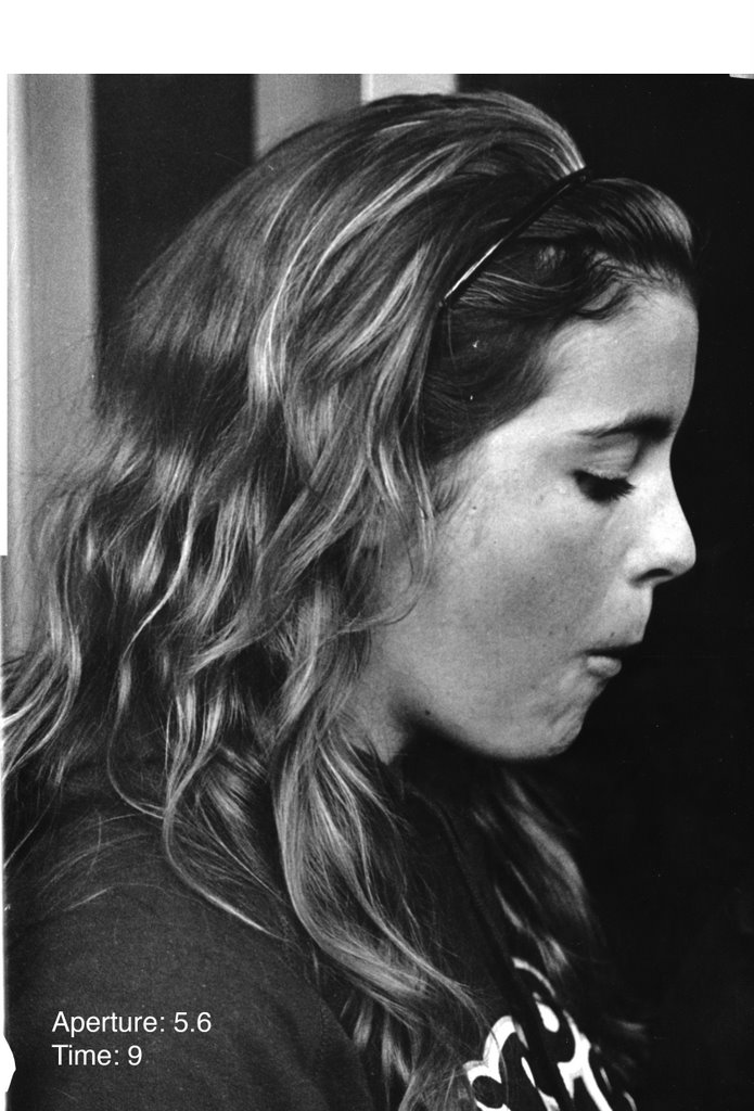
Note: All prints are in size 30*40cm, too large for the scanner, so final prints as shown here are only portions of the actual final prints.

Overall, these prints show fashion shots. Some have to do with practical fashion, like muddy boots, and some show how clothing makes people tend to label people, like "jock" and "preppy popped collar." While these show stereotypical clothing of these so called "types" of people, the model is the same for each shot, thus showing that the fashion shouldn't define the person.

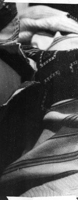
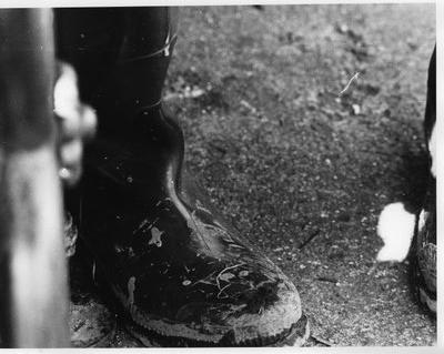
Shoes - Print One: "After Apple Picking"

Test Strip 1
Aperture: 5.6
Time: 6/8/10


I started out with these settings, only to result in a print that is too gray as well as too light. But it shows promise, because despite these flaws, you can still see some detail of the mud and texture of the ground.

Test Strip 2
Aperture: 8
Time: 6


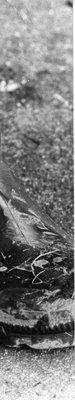
For the next test strip I closed the aperture to try to create more contrast between the boot and the mid on top. This test strip succeeds more, showing the gravelly ground in the background with pepper like texture, as well as the slick boot in the front. Now the image is more clear, as you can see the clumps of dirt on the front of the boot, especially around the tready part.

Test Strip 3
Aperture: 8
Time: 7


This time I increased the time to try to make the shade of the boot darker, and hence look slicker. This worked better in this print. Or it could be the larger view of the boot that makes it look like a smooth black boot muddied with texturized dirt.

Final Print
Aperture: 8
Time: 7


The final print shows the same characteristics as the test strip, just a larger view. In hindsight I wish that I had moved the paper to the left a bit more to get more of the bench in the image and hence create more balance. Next time.

Shoes - Print 2: "In the End"

Test Strip 1
Aperture: 5.6
Time: 6/8/10/12


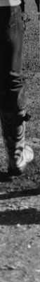
The first strip already showed decent contrast, which I think was already a feature of this particular shot due to the slanting light and the textured ground. The shadows provide a nice break from the monotony of the ground. Overall, however, it is too gray.

Test Strip 2
Aperture: 5.6
Time: 12


This test strip provides a slightly larger view of the image, and proves more useful for determining how the image as a whole looks. In this case, okay.

Final Print
Aperture: 5.6
Time: 12


Overall I think that this print turned out alright. It is simple, but the shadows are prominent and the texture of the ground is very precise. I personally like this image because it tells a story of when we went off apple picking.

Shoes: Print 3 - "Gillian's Boot"

Test Strip 1
Aperture: 8
Time: 5/6/7


The first test strip came out much too gray. The curvy lines of the pattern on the boot look faded rather than sharp. The lack of variation between the boot and between what appears to be the region beside the boot makes the image look dull.

Test Strip 2 and 3

Aperture: 5.6
Time: 2/3/4

Aperture: 5.6
Filter: 3.5
Time:4/5/6


I opened the aperture and decreased the time for the second test strip, hoping to make the dark regions stronger, and to leave it in the developer longer to achieve this. For the most part, the resulting test strip looked almost identical to the previous test strip, so I knew I had to try something else altogether.

So for test strip 3, I added a filter and kept the aperture at 5.6, hoping to enhance the contrast this way. This showed improvement, for in comparison to those test strips without a filter, the designs on the boot are much more sharp and defined.

Test Strip 4
Aperture: 5.6
Filter: 3.5
Time: 5


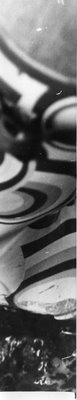
This larger test strip shows a larger region with some of the same settings: 5.6 aperture, 5 filter and the chosen time of 5 seconds, as selected by the last test strip. this came out well, as the image is clear, and especially towards the bottom of the boot, although the image begins to get out of focus, there is still contrast between the mud and leaves on the ground.

Final Print
Aperture: 5.6
Filter: 3.5
Time: 5


I tried a full print with these settings, hoping the rest of this image would look alright. I was a little worried that it would turn out to look worse in the areas surrounding the test strips, since they only looked at the areas in focus, and the other bits may not look right. It worked out thought, as the print looks uniformly sharp and contrasted throughout. I think that the settings are right and the contrast is good, though I am not wild about the print as a whole. I think that the composition is not interesting enough and that the pose looks contrived. This is one of my least favorite prints from the project and if I had shot more images of shoes, I probably would've selected a different one.
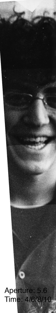
Clothing - Print 1: "Jock"

Test Strip 1
Aperture: 8
Time: 6/8/10/12


This was my first print, and I got a bit lucky with it, as I was pleased with the 8 second portion of my first test strip. Already from the settings in the test strip, there was detail in the wrinkles of the hand and the texture of the ball. The shadows that are the folds of the sleeve are also quite defined, which gives the clothing depth, and I particularly like the contrast of the arm against the richly dark colored body of the jacket.

Test Strip 2
Aperture: 8
Time: 8


I did this test strip to see if the contrast carried over to other parts of the image, and how the region to the left of the model, my brother Matthew, looked. I saw that it looked fine, that it is a dark background bordered by a curtain. The dark background was also nice to make Matthew, and particularly the ball in hand, to stand out.

Final Print
Aperture: 8
Time:8


As I said before, this is my favorite print, and I am very pleased with how it came out, both developing-wise as well as composition-wise. It is nice in the large size, as even the t-shirt underneath shows and especially the details that make it obvious that it is my brother, even without seeing his face: the wrinkly hands and the rip in his t-shirt. Though I hope that the print is good besides this fact, I think that I like this one because it is quite personal to me.

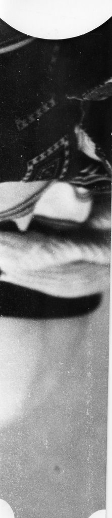
Clothing - Print 2: "Preppy Popped Collar"

Test Strip 1
Aperture: 11
Time: 4/5/6/7


The first test strip was not exposed for enough time, as the image looks old and faded. The contrast looks promising, in fact in this case, the image looks too bleached out, so I opted to close the aperture to accompany an increase in time in order to make the dark parts more pronounced, partularly the pattern in the tie and the stipes in the shirt.

Test Strip 2

Aperture: 8
Filter: 3.5
Time: 8/10/12


I added a filter to help along the contrast, as the image does not look sharp to begin with. This made the shot more grainy, which I am not really opposed to, and made the range of shades (especially with respect to where the right side of the tie meets the white shirt) much greater. Still, as the time is increased, as seen between the 10 and 12 second segments, this effect is lost as the test strip gets darker, or dark enough.

Test Strip 3
Aperture: 8
Filter: 4.5
Time: 16


I increased the filter, since the 3.5 filter helped, but didn't add dramatically to the quality of the print in comparison to the test strips without a filter. I focused on the tie since the rest looks okay anyways and this region is where I want the priority of contrast to be judged from.

Test Strip 4
Aperture: 8
Filter: 5
Time: 19/20/21


Since the 4.5 filter helped more than the 3.5, I decided to use a very high filter to continue to improve the image. This had a more drastic effect, making the dark areas, especially the neck area, quite dark. I focused on a larger area to see the effect n the rest of the collar area, rather than just the tie,and also to see the coloring of the skin, which is fine.

Final Print
Aperture: 8
Filter: 5
Time: 20


The final print shows good contrast and a nice compostion, showing off the patterns and fabrics of the clothes without showing Matthew's face. I am starting to like these shots that show only a portion of the whole, zoom in on a detail and give it more focus than it probably deserves.
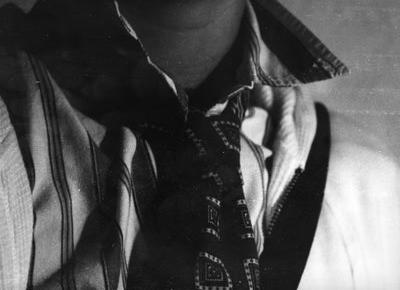
Clothing - Print 3: "Matthew the Model"

Test Strip 1
Aperture: 5.6
Time: 8/9/10


I started with the settings used for some other prints taken in the same lighting, and so the first test strip already showed promise, with contrast easily visible. The pattern in the tie is clear, and the stipes of the shirt nicely visible as well. I especially like that the wrinkles in the shirt have dark shadows, due to the lighting. The face is quite dark, which could be fine since hte purpose of the image is the clothing, but which could also be a non-issue since this side is the dark side of the face due to the lighting anyways.

Test Strip 2
Aperture: 5.6
Time:6.5


The second test strip shows a larger portion of the print, showing that the face is indeed visible on one side. The time is decreased, which softens the shirt somewhat. The contrast is very pronounced. Perhaps too much, for the face looks odd, but in this case, I kind of like it since it just makes the patterns all the more noticable.

Final Print


The final print turned out nicely, except for the part of the hair that has a chemically blur. While the pose is a bit too typical, it still makes for a somewhat interesting print.

Accessories - Print 1: "Messing Around"

Test Strip 1
Aperture: 8
Time: 6/8/10


This test strip shows that the image is too out of focus. The soft shading, due to not enough exposure time, makes this obvious. I decided the keep going with this one although it may be out of focus becuase the composition was nice.

Test Strip 2
Aperture: 5.6
Time: 6/8/10


I closed the aperture to make the image less bleached out and more uniformly shaded, to make the hat more pronounced. In this case, the nose and lips look better, still out of focus, but tolerably so, like it was done on purpose. The hat is too dark, but that is because the settings at 10 are too dark. Since the face region looks best between 6 and 8 seconds, I decided to try a full print at these settings in hopes that the hat would lighten up and be more detailed.

Test Strip 3
Aperture: 5.6
Time: 7


This print I left in the developer too long, for even though the hat now is in focus and visible, the face is too dark that it just looks awkward.

Final Print
Aperture: 5.6
Time:7


When I didn't leave it in the developer too long, it came out much nicer, as the cheek bones and details in the face are now visible.

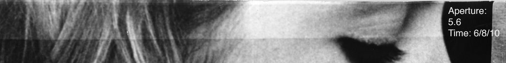
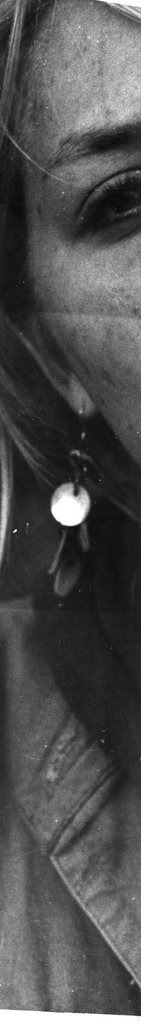
Accessories - Print 2: "Margotje and Bea"

Test Strip 1
Aperture: 5.6
Time: 8/10/12


I started with the times that were similar to other prints. This test strip is too dark. While I really like how the earring pops, the rest blends together too much, though I don't think that it is a contrast problem, rather the fact that it was exposed for too long. One other test strip at 6 seconds looked much better, but I didn't include this one since it is the same as the final.

Final Print
Aperture: 5.6
Time: 6


This final print came out really fun. I am not sure that peoples faces are my stong suit, but I think that this one turned out alright, as the eyes look dark in the places the should and the skin tone looks normal, but still shows a level of detail. I also like how fun and unposed this one is, since Bea's in the background, and in the photo by accident, but in a good way.

Accessories - Print 3: "ManBag"

Test Strip 1
Aperture: 5.6
Time: 5/6/7


This print was easy, since I started with the settings that I used for another in the same lighting conditions. Immediately it looked okay, with the darker end the best, around 8 seconds. There is enough detail in the shirt. The only think that is lacking is detail or texture in the bag. I think that I was focusing on the shirt rather than on the bag that Matthew's hand is holding on to.

Test Strip 2
Aperture: 5.6
Time:7


At 7 seconds, the rest of this region looks fine, just a little washed out, so there needs to be more time for the final print.

Final Print
Aperture: 5.6
Time:8.2


I raised time to 8.2 seconds just to be safe. And was pleased with the result, though I would have liked if the other accessories I had photographed came out so that this same outfit wasn't made into three prints. I like the pose and the balance between dark and light in this shot though.