9.14.2006

Lighting (part 1) P1/Q1: Printing/Compositions

Print 1: SPAIN [Portrait: Hard Lighting]

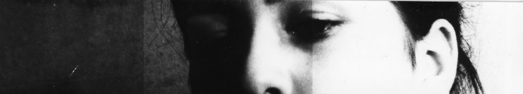
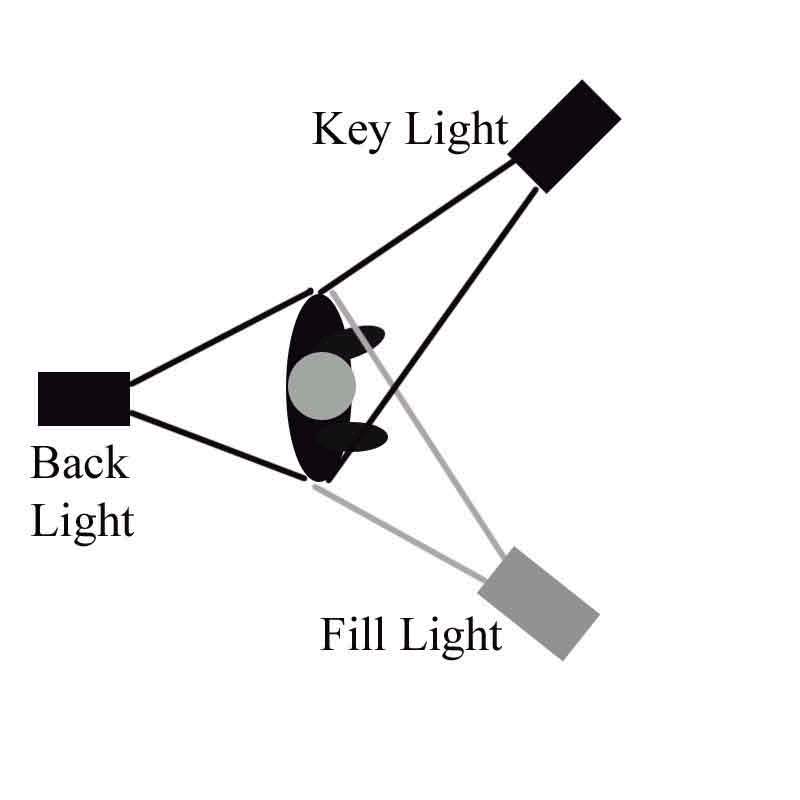
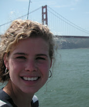
This print was taken using three point lighting set up at school with the professional lights. We were just experimenting, yet some of the images came out with the proper hard lighting effect (distinct shadows on the facial features). It's called SPAIN because the girl had SPAIN written on her Tshirt, which I cropped out of the final print.

Test strip 1

aperture: 5.6
time: 10


The test strip shows a grayish uniformity. This means that not only are the settings wrong, also the strip was not left in the developer long enough to make the dark parts rich enough. At this stage, the image still looks like a painting portrait, not a photography portrait.

Test strip 2

aperture: 5.6
filter: 3.5
time: 20/25/30


Next I added in a filter to try to remove this gray color, as it was making it look like there was a fog in front of the girl's face. The filter worked, as now we see a great contrast between her dark hair and the white skin, as well as detail in the eye area. The section of the test stip at 20 seconds is too pale, which makes her look sick. The time at 30 seconds is quite dark, although we can only see the wall, even that is too dark to see the crumbly texture of the wall. The middle section, at 25 seconds, however, is just right. There is shading around the nose area, and the eyes, but the lighter parts are not so light that it looks too unnatural. Also, you at 25 seconds, you can still distinguish the face from the wall behind.

Final Print

Camera: Nikon N60
Lens: 75-300mm

Aperture: 5.6
Filter: 3.5
Time: 25 seconds


The final print turned out well to demonstrate the effects of hard light. While the composition may be quite basic, it gets the point across about how hard lighting makes a face look. There is shadowing on the whole left side of the face, and each contour around the eyes and nose has a shadow. Another nice detain about hard light is that this shadowing takes place other places, like on the wall behind, and just beside the collar to make it look textured and grainy.

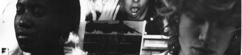
Print 2: Beginner's Confusion [Portrait: Soft Lighting]

This print was a second try. First I printed a full print of the same subjects, and it turned out that the print used primarily hard lighting. I've included the first version full print as a test strip, as I worked off of the settings of aperture, time, and filter that worked for the first try to see if they worked for the second.

Test strip 1, 2

1st:
aperture: 5.6
time: 8, 10, 12

2nd:
aperture: 5.6
filter: 5
time: 25/30/35


The first and second test strips show no range of shades. They are too dark and too gray. Even adding a filter 5 for the second test strip did not alter the contrast at all. So I decided to close the aperture.

Test strip 3

aperture: 11
filter: 3.5
time: 55,60,65


This helped some, but still, the faces are just one shade. The background is fine, but there is no level of detail on the faces of the subjects themselves. At this point I realized the trick of exposing the test strip for less time, and then placing it in the developer for longer, as if to give the dark shades more of a chance to show without exposing the light shades for more time. Hard to explain, but with the paper we were using, it worked for me.

Test strip 4

aperture: 11
filter: 3.5
time: 23 (note: left in developer longer)


Although at this point I realized that the print was hardly lit, I used about the same settings for the final print of the correct lighting situation.

Final Print

aperture: 11
filter: 3.5
time: 14


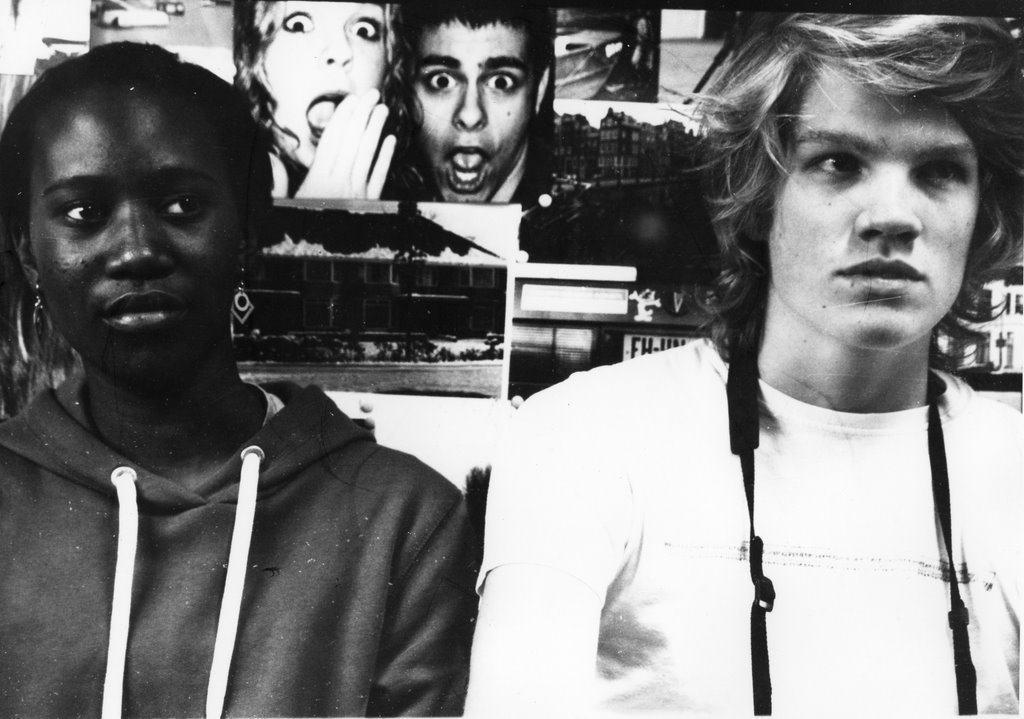
The final worked out nicely. The soft lighting is more obvious on Alex, yet both of them seem to glow a bit as the soft lighting from all sides is flattering to their faces, contrary to hard lighting. Here, soft lighting evens out the skin tone, and makes it smooth, while hard lighting caught all the textures and shapes on the face and made them noticable.

Print 3: Getaway Boat [Landscape: Hard Lighting]

Test strip 1,2,3

1st- aperture: 5.6, time:10,12,14,16
2nd- aperture: 8, time: 10, 12, 14
3rd- aperture: 11, time: 8,10,12


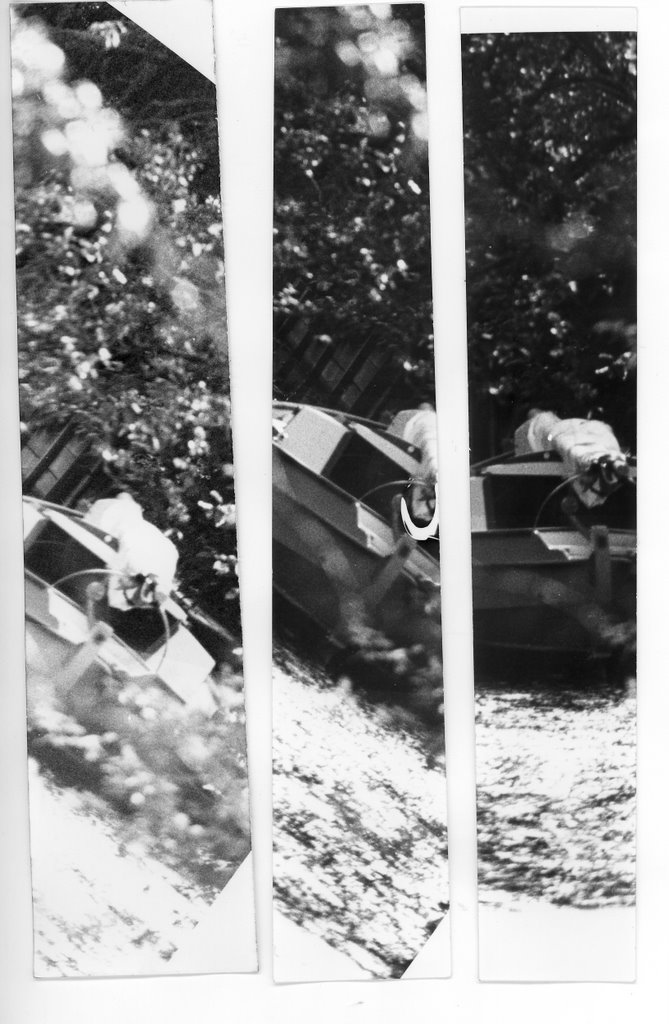
I tried each of these apertures to determine which was the best, looking mainly at the boat. At 5.6, the boat was dark, like its surroundings, so it blended in so much that it was almost lost. At 11, the boat was too pale and washed out. This was solved by going in the middle, at 8. Still, the print is not dark enough. So for the final print, I lowered the time and left it in the developer.

Final Print

aperture: 8
time: 8


The final print of the landscape image turned out better. The boat is distinguishable from its surroundings. Also there is contrast between the canal water and where the light reflects off of it. I like this lens, because it lets me zoom in on certain things more accurately that are far away, like this boat was, and frame them into a finished product like this.

Print 4: Bridge to [Landscape: Soft Lighting]

This image is a landscape photo using soft lighting. In places, the sun shines through the trees and hits something as hard lighting, such as the top of the bridge, but for the most part, the heavy trees mute the light so it shines softly and evenly.

Test Strip 1

aperture: 8
time: 7,8,9,10


This test strip is too faded. A good start, and the contrast looks like it will be okay, but at these settings, too bleached and washed out. For example, looking down the path into the light area: it fades into the grey circle around it, when I want it to be a light patch in a darker surrounding.

Test Strip 2

aperture: 8
time: 10


So I tried the whole thing at 10 seconds. This time it came out much better, as a shadowy image with a few light splotches, as it was when I took the photo.

Final Print

aperture: 8
time: 10


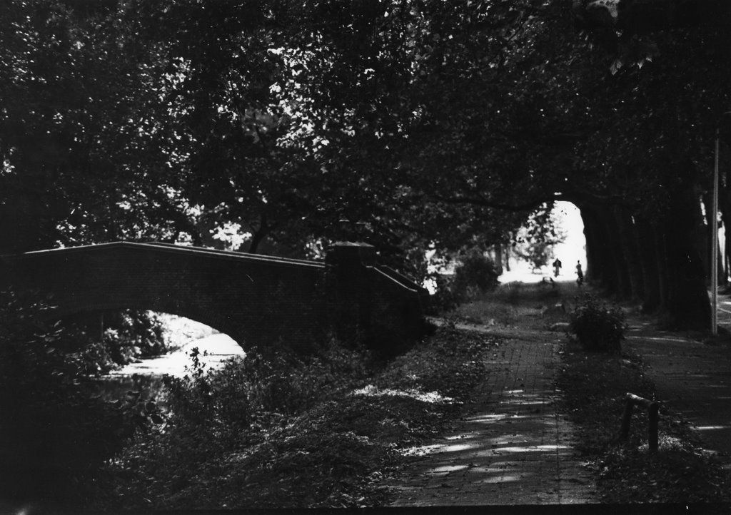
This final turned out well, as a softly lit shadowy scene featuring several lighter bits, where the light shines in from the trees and leaves circles on the ground, and the light coming from behind the bikers down along the path, which gives this part of the image and eerie look. I also like the perspective of looking down the path into the light at the end, like a tunnel of trees.

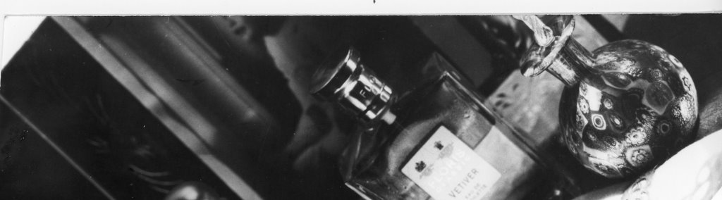
Print 5: Great Grandmother's Perfumes [Still Life: Hard Lighting]

This print is my favorite of the project. It was taken of my mom's makeup desk when the light was coming in the window strong and nearly horizontal.

Test Strip 1

aperture: 5.6
time: 8,10,12


This test strip shows a lack of contrast. There appears to be a fog in front of everthing. Even so, you can still see the shine of the caps of perfume bottles, so I could tell it would turn out nicely with more contrast. To get this, I closed the aperture.

Test Strip 2

aperture: 11
time: 18, 20, 22


This time there is more contrast. Although there is still too much gray, the bottles start to separate from each other and more detail is visible, for example the pattern on the picture frame behind the bottles. The problem now is that the time is too high and the time in the developer too low.

Final Print

aperture: 11
time: 14


Now the image shows proper contrast and proper shading. The darks are dark enough, so that they have rich color and the light coming in from the side creates bleached areas. For example, the container at the far left, on the left hand side of it, detail can be seen, but on the right, the pattern is lost to a bleached out area where light hits. The effect of the light streaming in from the side is to make the glasses look as thought they are glimmering, where enough detail is shown to make it interesting, but enough detail lost in some places to make it whimsical, even unclear. It looks like an antique, and the unconventional way that light illuminates and cast shadows makes it look even more from the past.

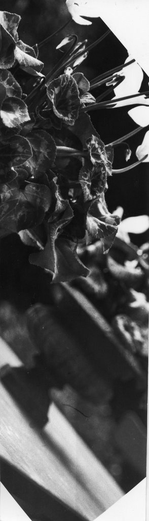
Print 6: Flower Pots [Still Life: Soft Lighting]

Test Strip 1

aperture: 5.6
time: 16,18


The first test strip shows okay contrast. There is some detail in the leaves between the green part and the lighter green veins. However, once you see below this, there is simply a dark region. the difference between the irn in front and the one behind, and between the one behind and the background is almost nonexistent.

Test Strip 2

aperture: 5.6
time: 6,7,8


So I tried lowering the time and leaving it longer in the developer. This helped to make the dark colors richer, and also provided more detail in the leaves, but did nothing to help set the irns and the background apart from each other.

Final Print

aperture: 8
time: 9


So for the final print, I chose the close the aperture to 8 and expose for 9 seconds. This solved the problem and the final print shows more clarity between the fore and background. Also, closing the aperture allowed for more detail in the irns themselves; now you can see the ridges and the design in the stone.

9.13.2006

Lighting (part I) P1/Q1: Diary Entry

First we shot some images of two fellow students in soft light, then another in hard light, without knowing too much about what we were doing. This turned out will though, because we learned by experience, and through using the equipment what to do, and what not to do. My contact sheet turned out with a little bit of both, so I was able to see the effect of both kinds of lighting.

I got on well with the hard lighting prints for portraits and still life. Using the new type of paper, I determined that lowering the exposure time and keeping the print in the developer for a longer time helps to make the black bits a richer black, though not at the expense of clouding the white parts. This helped for both of these images. I was excited for the print of my mom's jewelery desk thing. I thought that it would turn out pretty cool, because the sun was shining quite horizontally in through the window onto the glass jars and things on the desk, which created neat shadows and highlights in person. I am pleased with how the final turned out. Gnarly.

For the soft lighting portrait, I chose one that appeared to be soft lighting on the contact sheet, but turned out to be hard lighting. I only discovered this once I ended up with a harsh, hardly lit final print. The supposed change from sort to hard light was due to the fact that the contact sheet was too cloudy, so it looked like soft light, yet when the negative was printed properly, it turned out to be hard light. I did learn a bit about how what to look for in dark skin. Only when I developed the subject with dark skin properly did I see the light reflecting off of the cheekbones and forehead and casting shadows across the face. Then I noticed that it was hard lighting, and that the light on Alex only seemed to be soft light because he was slightly out of focus. So at this point, I had an extra hard light portrait...

And then all the images that I shot for landscape (hard and soft light) and for still life (soft) got lost because my camera went crazy on my and cut the negatives straight down the middle when it was rewinding. I hope that I can remember some of those shots, since I wanted to see how those turned out too. But this was quite annoying.

That's all up until this point, I will reshoot and see what comes of it.

Lighting (part I) P1/Q1: Image Bank

Charles Belden - Horses


Charles Belden was born in San Francisco in 1887. He was a rancher as well as a photographer, and generally photographed areas in Wyoming, with a particular interest in taking pictures of animals and aviation.

This Image, found at this site uses hard lighting. The large white cloud rising from the back of the pack is a foggy region where detail cannot be seen. Yet hard light makes the area in front of the stampede clear. The texture of the ground is distinguishable in from of the horses, contrasting with the foggy region behind. The hard lighting also helps to make the image vibrant and active. The shadows of the horses, cast out in front of the horse by a key light from behind help to establish this motion, by making the horses seem to chase the shadow. Also, as the key light is a back light, detail cannot be seen in the faces of the horses or the riders. This makes the scene hurried, as if there is no time to catch the look of the faces, only the shadows of figures racing by.

Harry Benson


Harry Benson was born in Glasgow, Scotland. He photographs mainly celebrity portraits. He got started as a photographer in London, trying to chase good stories to photograph for newspapers even though no one knew about him, and there were many other people like him waiting for a break. In the meantime, he learned photography well by himself. This big break came when he was assigned to follow the Beatles and take pictures of them, first around Europe, and then the US. Once he got to the US, his images became so well respected, and he made New York his home. He has photographed much of the last 50 years, presidents, celebrities, and the changes that occured in politics and social life in the US. His sometimes iconic photos have turned into a record of these years in history. In april of 2006, he was awarded the Lifetime Achievement Award at the Scottish Press Photography Awards.

I chose this image, from this site, because it makes effective use of hard light on a portrait. The light shines from the top, illuminating the forehead and nose, and casting shadows elsewhere. The texture and wrinkles of Sammy Davis Jr.'s (actor/dancer/singer) face are made prominent. We can see line of wrinkles and the comical expression is unmistakable. As the shadows shape and define the smirk on the cheeks, we cannot help but see the grin underneath the expression. It is aslo interesting to have a portrait without the eyes showing. The closed eyes make for an interesting picture, where we are able to pay more attention to what his face is saying rather than his eyes. Also, the portrait is very close up, leaving no background, no neck, and minimal shoulders. This makes the picture rather personal, even more than the fact that each wrinkle and each whisker can be seen under the harsh lighting.

Elliott Erwitt


Elliott Erwitt was born in Paris around 1928. When he was young he moved to the United States, where he studied at both the Los Angeles City College and the New School for Social Research. This education was followed by an assignment as an assistant photographer for the army in Europe, where he came in contact with many famous photographers. After that, he switched to freelance photography, mainly taking pictures for magazines. Today he is known for pictures of everyday things with a slight absurd twist on them.

I chose this image, from this site, because it is a landscape image, with a bit more to it. The foggyness at the back creates a soft light around the skyscraper, contrasted with the harder lighting, and lack of fog at the foreground that allows more detail to be seen. While the lighting is soft, I would not say that it is the main thing that adds interest to the image. I would attribute this to the composition - the placing of the foreground and the background in such different circumstances, as if they were not even connected by some ground in between. The woman, close to us, with an outline easily discernable gazes out into the misty background. She seems to mirror the interest that we feel at seeing this eerie background. While it is a simple skyscraper, it has been presented in such a way as to make it seem 'out there' and different. Nothing can really be seen around the skyscraper except a few shapes, but mainly, it is the skyscraper and the woman, alone. The image is tranquil, and seems to provide the viewer with a minute to just look and enjoy the way that something so normal can be made abnormal, to enjoy some everyday thing in a new way as the woman does.

Sources:

1)http://www.wyomingtalesandtrails.com/beldenhorses.jpg
2)http://en.wikipedia.org/wiki/Charles_Belden
3http://www.takegreatpictures.com/HOME/Columns/Photo_Book_Reviews/Details/params/object/4996/default.aspx
4)http://www.atlantagalleryassociation.com/gallery_shows/uploaded_images/Jackson2-736035.jpg
5)http://en.wikipedia.org/wiki/Elliott_Erwitt

9.08.2006

Lighting (part I) P1/Q1: Theory Notes

Lighting is essential in photography. The amount of light (also called intensity or brightness) affects the contrast of the image, while the placement and situation of light controls the mood and emotions. Photographers can alter the light to make a part of a subject stand out or a to make certain emotion prominent.

Light comes in two ways, HARD LIGHT and SOFT LIGHT. These two are called light qualities.

Hard Lighting

What it does: Hard light can create a dramatic effect. This sets shadows in certain places, and the direction from which the light shines (as seen by the subject) is also discernable from the final image. Used to make an image, bold, angry, or serious, etc. For example, if you are shooting a subject with wrinkles, hard light will make those stick out. Otherwise, hardlight will show the "chiseling" of features, and produce bright highlights in the eyes.

How to Achieve Hard Light: Hard light comes from point light sources: an electronic flash, the sun, or a studio light. Remember also that there is a difference between sunlight streaming into a window and daylight. Daylight is a combination of sunlight and skylight. When using a bulb, "barn doors," the adjustable flaps on the sides of the studio light are used in order to control where that light goes. For example, sometimes you may wish for hard light on the subject's face to define their features, but soft light on their shoulders.

[As for direction of light, this comes in three ways. First, there can be a front light, used to show detail. Usually used in the form of soft light and not hard light. Second, there can be a side light. This is useful in showing texture (think of a sideways light making sideways shadows over something bumpy, these "stick out" more. Third, there can be a backlight. This is a light placed directly behind the subject, and makes for a dramatic image. It can also separate the subject from the background. The light is usually softened naturally as it must first come in contact with the subject before reaching the film.]

Hard Lighting example [Photo taken from this page.]


In this case, hard lighting is used to help show texture. While soft lighting would have dulled the texture, hard lighting takes advantage of the ridges and bumps of the cactus, as its hards shadows define them.

Soft Lighting

What it does: Soft light is light that comes from a reflected source or a broad source. It is indirect light that doesn't throw shadows, rather, evens out the distribution of light. This is because there are many paths that the light can take before reaching the subject and the film, whereas hard light is intentionally directed in a certain direction.

How to Achieve Soft Light: Soft light can be found in an over cast sky, a large window that is close the subject, or a bulb reflected off of and umbrella [or a brollie if you prefer]. Soft panels also are a way to achieve soft light. They consist of one black panel, and one white panel. The light source can be controlled in that moving it closer to or away from the subject will change the size of the source.

White or Silver Brollie? When you use a silver lined brollie and reflect light off of it, the light slightly softens, and about half of the light reaches the sunject as opposed to a naked bulb. White brollies can be used in two ways. First, you can reflect light off of the brollie, which yields roughly the same results as a silver lined one. Or, you can shine the light through them, which results in a slightly harder light. If you choose to use a brollie, then you will get a diffuse light source, which means that it is light coming at all sorts of angles. The effect of this is that The opposite of this is a specular source, which is organized into parallel rays.

Soft Lighting example [Photo taken from this page.]


In this image, soft lighting helps to set the mood or emotion for the picture. Hard lighting would have been too harsh, but soft lighting makes the image stagnant and calmed.

Three-Point Lighting

Three point lighting consists of three separate lights, used to manipulate light to either make shadows prominent, or non-existent, whichever the artist prefers.

The Key Light is the main light used. In indoor shots, it is a specialized light, or a flash. In outdoor shots, it is often the sun. The most common way to situate the key light is at a 30-60 degree angle with respect to the camera. A very high key light will create prominent shadows that make the cheek bones very defined. A low key light distorts the subject and creates an eerie effect. As the "principal illuminator" it is the most important to the overall lighting design of the photograph.

The Fill Light helps to make the image look more natural. It is often a light shone at an angle to the key light, usually a right angle, which minimizes those shadows created by the key light, under the nose, by the ears, neck, and so on. Sometimes a low fill light can be used on purpose in order to achieve some sort of stylistic effect. A fill light significantly less bright than the key light will result in a more contrasted image, while one closer in brightness to the key light will result in less contrast. Occasionally, this is not even a separate bulb, rather, a large white sheet, white wall, or reflective material used to bounce the light from the key light at a different angle to fill in the shadowy areas. This should be placed close to the subject, as it is a softer light.

The Back Light shines from behind (not always directly, sometimes at a slight angle) and serves to separate the subject from the background. In the following image taken from here, the difference between no back light and a back light can be seen. The image on the right, with a backlight, is more distinctive than that on the left, with a nice rim of light surrounding the subject.


A website that shows how the combination of these three lights effects the subject and where the light and shadow parts hit can be found here.

Three point lighting diagrams

a) This diagram, from here, shows where the light hits, and also shows the relative intensity of the lights.


b)This diagram, from this site shows a three point lighting system using a reflector as a fill light, rather than a separate bulb.


Sources

1) http://www.scphoto.com/html/lighting.html
2) http://photo.net/learn/studio/primer
3) www.3drender.com/light/3point.html
4) http://en.wikipedia.org/wiki/Three-point_lighting
5) http://www.geocities.com/iconostar/three-point.jpg
6)http://www.ourvideo.org/toolkit/files/webimages/pics/threepointlighting.jpg