11.25.2008
4.07.2008
8.09.2007
3.29.2007
In Motion (P6/Q3): Printing-Compositions
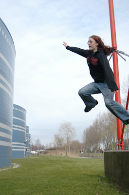
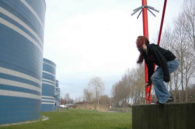
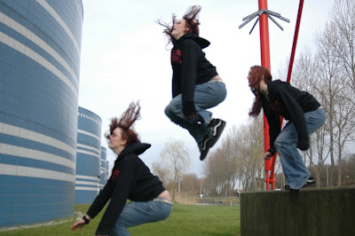
Print One: Rozy in Flight
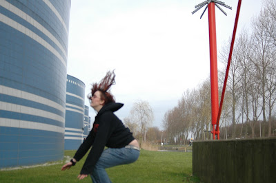
This is the final of the print of Rozy jumping off of the cement block. I tried various other combinations, putting three separate images together with photoshop. I decided to use these two, as Rozy was perfectly in focus in these two shots, and I also like the poses and how active they look. The two shots that I started with were these two:
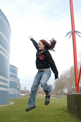 I took the first one and used it as the background in a photoshop canvas. I then copied Rozy from the second image and placed her as a layer on top of the background. then I erased the areas around Rozy in the second image so that she was superimposed on top of the first.
Then I took a piece of the blue wavy wall and fixed the size and angle and everything and added it to the lefthand side of the print in order to extend the wall.
This is the final print:
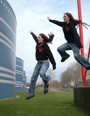
The final print is alright. I think that a landing would have been good, because it seems more logical to have three poses in a jump like this. On the other hand, I like the way that it is incomplete without a landing, and kind of fun that she is in the air in both poses. I also like the way the second pose looks like she is floating down onto the ground. Tried to apply a cool filter to the clouds, but this didn't improve them much, perhaps I should have tried more things to make the sky more dynamic and less bland.
Print Two: Rozy Cannonballing
This one was the one that I tried before doing the one above. It helped me to learn how to work with the different layers in photoshop, adding a new layer and erasing the extra stuff around Rozy to make it look like the poses are in the same frame.
I began with these three shots:
 This one I chose because I like the cannonball and the way her hair flies and it looks like she is just on the verge of jumping out of the frame of the photo.
Final Print:
 The final print is alright. As I mentioned in my diary entry, the print is very symetrical, and she is moving completely to horizontal with respect to the camera, so there isn't very much creative or new to this one. I do like the poses themselves individually, and also the way that she is in focus enough to see her poses, but not enough to really see her face or anything. Also, the launch of this one is really nice, because you can see her motion of literally pushing off of the cement block to lift into the air. Much more effort shown in this one than print one.
Extra Print: Lauren in Flight
 I included this extra print just because I took it while in the middle of editing the one of Rozy at a track meet over the weekend, and think it follows with the whole idea of shooting motion. Besides not being sharp enough, the motion itself is good, as Lauren is caught mid-air, completely stretched out at the top of her jump. Also, I crouched pretty low down close to the track and shot at a slightly upwards angle to make her look more elevated.
This is the final of the print of Rozy jumping off of the cement block. I tried various other combinations, putting three separate images together with photoshop. I decided to use these two, as Rozy was perfectly in focus in these two shots, and I also like the poses and how active they look. The two shots that I started with were these two:

 I took the first one and used it as the background in a photoshop canvas. I then copied Rozy from the second image and placed her as a layer on top of the background. then I erased the areas around Rozy in the second image so that she was superimposed on top of the first.
Then I took a piece of the blue wavy wall and fixed the size and angle and everything and added it to the lefthand side of the print in order to extend the wall.
This is the final print:

The final print is alright. I think that a landing would have been good, because it seems more logical to have three poses in a jump like this. On the other hand, I like the way that it is incomplete without a landing, and kind of fun that she is in the air in both poses. I also like the way the second pose looks like she is floating down onto the ground. Tried to apply a cool filter to the clouds, but this didn't improve them much, perhaps I should have tried more things to make the sky more dynamic and less bland.
Print Two: Rozy Cannonballing
This one was the one that I tried before doing the one above. It helped me to learn how to work with the different layers in photoshop, adding a new layer and erasing the extra stuff around Rozy to make it look like the poses are in the same frame.
I began with these three shots:

 This one I chose because I like the cannonball and the way her hair flies and it looks like she is just on the verge of jumping out of the frame of the photo.
Final Print:
 The final print is alright. As I mentioned in my diary entry, the print is very symetrical, and she is moving completely to horizontal with respect to the camera, so there isn't very much creative or new to this one. I do like the poses themselves individually, and also the way that she is in focus enough to see her poses, but not enough to really see her face or anything. Also, the launch of this one is really nice, because you can see her motion of literally pushing off of the cement block to lift into the air. Much more effort shown in this one than print one.
Extra Print: Lauren in Flight
 I included this extra print just because I took it while in the middle of editing the one of Rozy at a track meet over the weekend, and think it follows with the whole idea of shooting motion. Besides not being sharp enough, the motion itself is good, as Lauren is caught mid-air, completely stretched out at the top of her jump. Also, I crouched pretty low down close to the track and shot at a slightly upwards angle to make her look more elevated.
 In Motion (P6/Q3): Diary Entry
This project began with shooting with Rozy using her digital camera outside. The conditions began sunny, and then we came inside and realized some changes that we needed to make to the way we were shooting. We needed to use a faster shutter speed to freeze motion, and also shoot some with a slower shutter speed to blur the motion. All in all, we needed to focus on capturing the subject, in this case, Rozy jumping and clearly show the motion, not just by using the effect of blurring her while she jumped, but also in showing her position in the air, having her in an action pose. When we went back outside to shoot, it had clouded over.
We took the images into the lab and compiled them with the idea of making one print with three or four poses showing the progression of the jumps. Using photoshop, I tried to combine several different jumps, putting together the beginning middle and end of separate ones. This proved to be hard, because when they were put together, it was obvious that one of the poses was out of place, without being able to describe why. Even the slightest change in sharpness or direction of motion, or even where her legs were, gave away that the poses didn't all belong to one jump. So after that, I decided to go with the best progression, rather than going with the best beginning middle and end poses which ended up looking unnatural.
So for the first one, I chose a jump where she springs from the cement block, curls her legs into a cannonball and then lands on the ground. The jump is very symmetrical, and other than the middle jump, where her hair is flying up and it looks very much in motion, there wasn't much special about this one. I decided to include it anyways, and then moved on to the second print.
The second one was a series of two jumps which I like because the poses are similar, and very obviously followed one another. Also, the photo is very vertical, and she seems to be mid jump at the first pose and landing towards the ground on the second pose, so it looks like she came falling from pretty high. I like this one because the jump is not complete, and it is not just a horizontal motion, but rather looks like she is jumping at an angle to the camera. Also the way that she is close to the camera and large in the frame makes it look crowded, and like she was jumping really close by.
The way I did this was in photoshop, using one of the jumps and the background as the main photo, and adding the pose of another shot as a layer on top, erasing all the extra things around the pose so it seems to be in the same frame.
3.27.2007
In Motion (P6/Q3): Image Bank
Subject in Motion, Background out of Focus
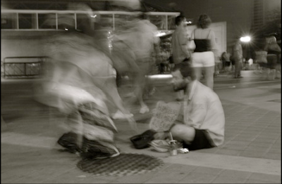
Carl Zoch Carl Zoch Fine Art is an American photographer of fine art, portraiture, and weddings. His style tends to be spacious and calm, in contrast to the chosen image. In this image, there are two subjects. One is the man sitting on the sidewalk, out of focus, and the other is the person moving quickly into the frame, his motion blurred and what he looks like concealed. Apart from looking interesting, having two subjects in drastically different clarity and focus, the use of motion helps to enforce the idea of the image. While the possibly homeless man is holding up a sign, steady, and constantly sitting there, various people come and go, walking past him and then fading into the background. Then there is the main blurred man, unrecognizable and moving fast. This helps to evoke a somber emotion. While the homeless man stays and asks for help, other people are free to walk by and enjoy the night, moving fast and not looking back. This helps to show the contrast in pace of life between those relatively fortunate and those unfortunate. One gets left behind, where the rest of the world is transient and moving fast onto other things, and he just stays, and watches it all pass by.
Subject in Focus, Background out of Focus
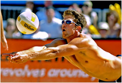
Chris Ditto grew up playing little league sports in West U, Texas. Later he developed an interest in photographing these sports, disciplining himself to get to sports events early to find interesting angles and plan out the shots he hoped to take later on. Self-trained, he is now a freelance photographer based out of Austin, Texas. His work is displayed by magazines such as ESPN, The Houston Chronicle, People magazine, TIME magazine, and Sports Illustrated. This image from the sports collection of his gallery at Ditto Photography captures the motion of both the ball and the diving volleyball player. The background is out of focus; you can barely see the spectators looking on. Both the man and the ball, though clearly in motion, are sharply in focus, a nice contrast with the blurry background. The sun is also a nice touch for the image, gleaming off of the top of his back and enhancing how horizontal he is. This image is particularly nice for how it "freezes" the motion, showing a huge amount of detail including the expression of effort and concentration on the volleyball player's face.
Carl Zoch Carl Zoch Fine Art is an American photographer of fine art, portraiture, and weddings. His style tends to be spacious and calm, in contrast to the chosen image. In this image, there are two subjects. One is the man sitting on the sidewalk, out of focus, and the other is the person moving quickly into the frame, his motion blurred and what he looks like concealed. Apart from looking interesting, having two subjects in drastically different clarity and focus, the use of motion helps to enforce the idea of the image. While the possibly homeless man is holding up a sign, steady, and constantly sitting there, various people come and go, walking past him and then fading into the background. Then there is the main blurred man, unrecognizable and moving fast. This helps to evoke a somber emotion. While the homeless man stays and asks for help, other people are free to walk by and enjoy the night, moving fast and not looking back. This helps to show the contrast in pace of life between those relatively fortunate and those unfortunate. One gets left behind, where the rest of the world is transient and moving fast onto other things, and he just stays, and watches it all pass by.

Subject in Focus, Background out of Focus
Chris Ditto grew up playing little league sports in West U, Texas. Later he developed an interest in photographing these sports, disciplining himself to get to sports events early to find interesting angles and plan out the shots he hoped to take later on. Self-trained, he is now a freelance photographer based out of Austin, Texas. His work is displayed by magazines such as ESPN, The Houston Chronicle, People magazine, TIME magazine, and Sports Illustrated. This image from the sports collection of his gallery at Ditto Photography captures the motion of both the ball and the diving volleyball player. The background is out of focus; you can barely see the spectators looking on. Both the man and the ball, though clearly in motion, are sharply in focus, a nice contrast with the blurry background. The sun is also a nice touch for the image, gleaming off of the top of his back and enhancing how horizontal he is. This image is particularly nice for how it "freezes" the motion, showing a huge amount of detail including the expression of effort and concentration on the volleyball player's face.

In Motion (P6/Q3): Theory Notes
Shooting Motion
There are several things to think about when shooting motion. The trouble with shooting motion is getting a photo sharp if you want to to freeze the motion and retain detail, or choosing to blur the motion. If you choose to freeze the motion and have the moving object or person in focus, it is still important to represent the motion of the subject in some way.
Freezing Motion
In order to free motion, the priority should be to set your shutter speed very high, to something upwards of 1/300th of a second. (aperture should then be adjusted appropriately to compensate for the fact that a fast shutter speed lets in very little light - that is, the aperture should be very wide). This number could be even higher, such as 1/1000th of a second in the case that the object is moving very very quickly or that the object is extremely close to the camera, in which case it is going much quicker relative to the camera lens.
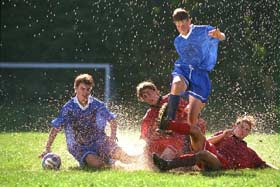 In this shot of soccer players, from Kodak: Photographing Sports and Action, the players as well as the water drops are frozen, clearly visible. The use of a VERY fast shutter speed means that the drops were exposed just at the moment they were in the air, and the players stopped in their motion. In this way, we are able to clearly see the strained looks on the faces and the effort the kids are putting in to get to the ball. It's also nice to see the confusing tangle of players and water sharply to see what's going on.
Blurring Motion
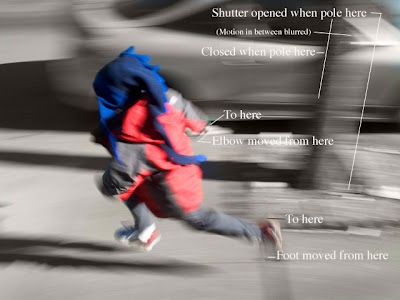
Can be done in the opposite way. By having a slow shutter speed, from the time of opening the shutter to the time when it closes again, the subject has traveled from point A to point B. The area in between will capture all the motion in between leaving a blurred subject which shows exactly what path the subject took. The movements are annotated in the following, where starting and ending points of motion are shown and the spots in between blurred.
Panning Panning is a technique for making the subject in focus and the background or any moving parts of the subject in motion and blurred. This is achieved by moving the camera with the action of the subject. You have to keep the subject in the viewfinder and have it moving slowly and steadily at the same speed as the subject before, during, and after the shutter is opened (using a relatively slow shutter speed). In this way, the subject will be sharp, while the background will be blurred, usually streaked in the direction of motion to show how rapidly the subject is moving past.
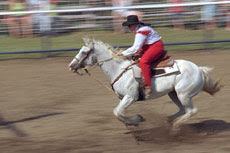 In this case, from Kodak: Photographing Sports and Action, the top of the horse and the rider are sharp and in focus, while the feet of the horse are blurred and you can see the motion. The background is also blurred, but differently than the feet, for instead of being out of focus, it is streaked and looks like you are speeding by with the horse. It's also worth noting that the horse is off center, as when photographing motion, it is helpful to leave space in front of the subject to more or less give them room in the frame.
 In this example, from Photoshop Methods of Expressing Motion in Photography Tutorial, the rider is also in an interesting position. While he is not sharp necesarily, he is less blurred than the background, which seems to be going by at an angle. The effect of panning angularly is very interesting, because you can see the direction of motion and the diagonal nature of the streaks and the riders direction of motion makes the image dynamic.
Blurring Only the Subject
Is done using a tripod and a slow shutter speed. In this way, when the shutter opens for a long time, the background will not move, and hence will show up clear and sharp. However, allowing the shutter to be open long means that whatever is moving in the viewfinder will be blurred. This is commonly done with headlights of cars and trains.
This example, from Kudos Photography Portfolio, shows headlights blurred along highway. It is interesting because the image appears to be in focus, as the sides of the highway are clear, and the bright headlights show clearly the motion of the cars and define the direction of the highway.
There are several things to think about when shooting motion. The trouble with shooting motion is getting a photo sharp if you want to to freeze the motion and retain detail, or choosing to blur the motion. If you choose to freeze the motion and have the moving object or person in focus, it is still important to represent the motion of the subject in some way.
Freezing Motion
In order to free motion, the priority should be to set your shutter speed very high, to something upwards of 1/300th of a second. (aperture should then be adjusted appropriately to compensate for the fact that a fast shutter speed lets in very little light - that is, the aperture should be very wide). This number could be even higher, such as 1/1000th of a second in the case that the object is moving very very quickly or that the object is extremely close to the camera, in which case it is going much quicker relative to the camera lens.
 In this shot of soccer players, from Kodak: Photographing Sports and Action, the players as well as the water drops are frozen, clearly visible. The use of a VERY fast shutter speed means that the drops were exposed just at the moment they were in the air, and the players stopped in their motion. In this way, we are able to clearly see the strained looks on the faces and the effort the kids are putting in to get to the ball. It's also nice to see the confusing tangle of players and water sharply to see what's going on.
Blurring Motion
Can be done in the opposite way. By having a slow shutter speed, from the time of opening the shutter to the time when it closes again, the subject has traveled from point A to point B. The area in between will capture all the motion in between leaving a blurred subject which shows exactly what path the subject took. The movements are annotated in the following, where starting and ending points of motion are shown and the spots in between blurred.

Panning Panning is a technique for making the subject in focus and the background or any moving parts of the subject in motion and blurred. This is achieved by moving the camera with the action of the subject. You have to keep the subject in the viewfinder and have it moving slowly and steadily at the same speed as the subject before, during, and after the shutter is opened (using a relatively slow shutter speed). In this way, the subject will be sharp, while the background will be blurred, usually streaked in the direction of motion to show how rapidly the subject is moving past.
 In this case, from Kodak: Photographing Sports and Action, the top of the horse and the rider are sharp and in focus, while the feet of the horse are blurred and you can see the motion. The background is also blurred, but differently than the feet, for instead of being out of focus, it is streaked and looks like you are speeding by with the horse. It's also worth noting that the horse is off center, as when photographing motion, it is helpful to leave space in front of the subject to more or less give them room in the frame.
 In this example, from Photoshop Methods of Expressing Motion in Photography Tutorial, the rider is also in an interesting position. While he is not sharp necesarily, he is less blurred than the background, which seems to be going by at an angle. The effect of panning angularly is very interesting, because you can see the direction of motion and the diagonal nature of the streaks and the riders direction of motion makes the image dynamic.
Blurring Only the Subject
Is done using a tripod and a slow shutter speed. In this way, when the shutter opens for a long time, the background will not move, and hence will show up clear and sharp. However, allowing the shutter to be open long means that whatever is moving in the viewfinder will be blurred. This is commonly done with headlights of cars and trains.
This example, from Kudos Photography Portfolio, shows headlights blurred along highway. It is interesting because the image appears to be in focus, as the sides of the highway are clear, and the bright headlights show clearly the motion of the cars and define the direction of the highway.

2.12.2007
A Contemporary Photo (P5/Q3): Printing-Compositions
To edit the print of the Masai warrior, I used photoshop and applied a dark blue filter selectively to the sky. This was done to improve the way the clouds looked, that is to make them more pronounced and to make the color less faded. When the filter was applied to the photo as a whole, the robe changed color and the warmth on the left hand side (from the sun setting) was removed, a touch that I quite liked. So I decided to apply it only to the clouds.
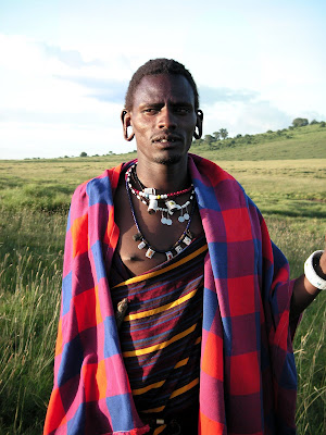
One thing that could be improved would be the inclusion of his hand and staff, as the staff was an important part of the Masai culture, being something which the men all carry and is used for herding cows and goats, the trademark of Masai culture. I am glad that the white beads around his wrists and those around his neck were included, as they also played a crucial role to Masai culture. This is because when doing traditional Masai dances including the characteristic high jumps, they do not use instruments, not even drums. Rather the thumping of their feet and staff and the jangling of their beaded jewellery provide the music so that the dance and the music itself are inseperable. See "Diary entry" for more about Masai culture.

One thing that could be improved would be the inclusion of his hand and staff, as the staff was an important part of the Masai culture, being something which the men all carry and is used for herding cows and goats, the trademark of Masai culture. I am glad that the white beads around his wrists and those around his neck were included, as they also played a crucial role to Masai culture. This is because when doing traditional Masai dances including the characteristic high jumps, they do not use instruments, not even drums. Rather the thumping of their feet and staff and the jangling of their beaded jewellery provide the music so that the dance and the music itself are inseperable. See "Diary entry" for more about Masai culture.
A Contemporary Photo (P5/Q3): Diary Entry
Original Plan
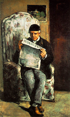
The purpose of this project was to "produce one contemporary photo of a classic painting of your choice that includes a human subject/s." We were shown some examples in a fashion art book of taking a traditional painting or work of art and replicating this in a photo, retaining the main idea or emphasis in the contemporary photo. In this way, the original work of art was presented in a tweaked or slightly altered way, but still recognizable for the main emphasis shared shared between the new and altered version. My original plan was to do a contemporary interpretation of either Cezanne's "The Card Players" (1892) or Cezanne's "The Artist's Father" (1866).
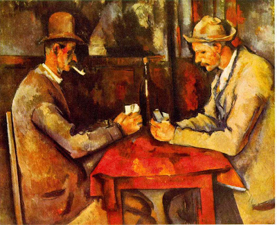 For "The Card Players," I wanted to preserve the idea of what people do in their free time, in this case, I would update the poker set and clothing, but retain the concentration and timelessness of a game of cards.
 For the
I was hoping to convey for "The Artist's Father" the way that people relax and catch up on news today, in a similar pose, but other surroundings. While this is in a cozy living room chair setting, I would place the reader in an airport with an Ipod in their ears, to show the way people relax today, which is seldom, and on-the-go.
What Really Came Out of It
In between one bad shoot and when I was planning to reshoot digitally, I went to Tanzania on the school service trip. There we were responsible for helping to build a classroom for Kirima Secondary School near Moshi for five days followed by a two day camping trip and a safari. I got a book full of portraits by Steve McCurry from around the world, and was inspired by this to get some portraits from the trip. We visited a Masai village near the Ngorogoro Crater, where I met the Masai warrior from my final print for the project. As we were walking away from the village, this man was walking parallel to us at some distance leading some cows with a staff. He motioned for me to take a photo of him with his cows, pointing to them as if to say "include them!" Considering what we had just learned about the importance of cows to Masai culture - that cows were a measure of wealth, as they provided on behalf of the chief the milk and meat for the village, thus dictating how many wives a man could have (the more cows, the more wives and children the chief can support. In this particular boma, the chief had four wives and 25 children. ) - I could see why this warrior wanted his picture taken with his cows - he was proud. After I took that shot, he came over, all smiles, and asked me to take another one. I was happy with this, since I was hoping to get portrait shots, and the background of hills and blue sky was perfect - not to mention he was all decked out in Masai clothing and beads. I don't think that I was as happy as he was though. As soon as I positioned the camera to take a photo, his smile disappeared, his hand went up with his staff, and he got a serious photo-taking face on. Immediately after, he demanded to see what it looked like, I showed him and he was pleased.
We were talking later in the car about how interesting the culture was, the polgamy, the norm for girls to be married around 12-14, the government requirement that the children attend school, things like that, especially the cow emphasis, and I thought again about how much that man wanted to be photographed. While most were hesitant to have pictures taken, besides the kids, he demanded it. I thought of the desire for people to leave their stamp and their legacy in the form of a portrait, and I was reminded of how monarchs used to have their portraits painted in those pompous triumphant poses just to leave behind a memory of themselves. Because they were proud. This was little different. this experienced warrior (for each battle, warriors cut a piece of their ear, which this warrior has) was determined to show his "kingdom" and what he had achieved in the form of a lasting picture. He stopped smiling for the picture to have a serious, dominant presence, much like monarchs posed all tall and looking off into the distance all noble-like.
The portrait that I found to be particularly representative of this habit of monarchs having themselves painted is one of Willem I Prince of Orange of the Netherlands. He has a royal red robe, and a very strong and confident, almost showy, stance.
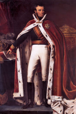 The portrait of the Masai warrior from Tanzania shows similar characteristics, though far removed by time and cultural differences. He is also confident and dominating. the red robe is a nice echo, as is the shared characteristic of the need to leave a mark showing their achievements and what they own, what they are proud of.

The purpose of this project was to "produce one contemporary photo of a classic painting of your choice that includes a human subject/s." We were shown some examples in a fashion art book of taking a traditional painting or work of art and replicating this in a photo, retaining the main idea or emphasis in the contemporary photo. In this way, the original work of art was presented in a tweaked or slightly altered way, but still recognizable for the main emphasis shared shared between the new and altered version. My original plan was to do a contemporary interpretation of either Cezanne's "The Card Players" (1892) or Cezanne's "The Artist's Father" (1866).
 For "The Card Players," I wanted to preserve the idea of what people do in their free time, in this case, I would update the poker set and clothing, but retain the concentration and timelessness of a game of cards.
 For the
I was hoping to convey for "The Artist's Father" the way that people relax and catch up on news today, in a similar pose, but other surroundings. While this is in a cozy living room chair setting, I would place the reader in an airport with an Ipod in their ears, to show the way people relax today, which is seldom, and on-the-go.
What Really Came Out of It
In between one bad shoot and when I was planning to reshoot digitally, I went to Tanzania on the school service trip. There we were responsible for helping to build a classroom for Kirima Secondary School near Moshi for five days followed by a two day camping trip and a safari. I got a book full of portraits by Steve McCurry from around the world, and was inspired by this to get some portraits from the trip. We visited a Masai village near the Ngorogoro Crater, where I met the Masai warrior from my final print for the project. As we were walking away from the village, this man was walking parallel to us at some distance leading some cows with a staff. He motioned for me to take a photo of him with his cows, pointing to them as if to say "include them!" Considering what we had just learned about the importance of cows to Masai culture - that cows were a measure of wealth, as they provided on behalf of the chief the milk and meat for the village, thus dictating how many wives a man could have (the more cows, the more wives and children the chief can support. In this particular boma, the chief had four wives and 25 children. ) - I could see why this warrior wanted his picture taken with his cows - he was proud. After I took that shot, he came over, all smiles, and asked me to take another one. I was happy with this, since I was hoping to get portrait shots, and the background of hills and blue sky was perfect - not to mention he was all decked out in Masai clothing and beads. I don't think that I was as happy as he was though. As soon as I positioned the camera to take a photo, his smile disappeared, his hand went up with his staff, and he got a serious photo-taking face on. Immediately after, he demanded to see what it looked like, I showed him and he was pleased.
We were talking later in the car about how interesting the culture was, the polgamy, the norm for girls to be married around 12-14, the government requirement that the children attend school, things like that, especially the cow emphasis, and I thought again about how much that man wanted to be photographed. While most were hesitant to have pictures taken, besides the kids, he demanded it. I thought of the desire for people to leave their stamp and their legacy in the form of a portrait, and I was reminded of how monarchs used to have their portraits painted in those pompous triumphant poses just to leave behind a memory of themselves. Because they were proud. This was little different. this experienced warrior (for each battle, warriors cut a piece of their ear, which this warrior has) was determined to show his "kingdom" and what he had achieved in the form of a lasting picture. He stopped smiling for the picture to have a serious, dominant presence, much like monarchs posed all tall and looking off into the distance all noble-like.
The portrait that I found to be particularly representative of this habit of monarchs having themselves painted is one of Willem I Prince of Orange of the Netherlands. He has a royal red robe, and a very strong and confident, almost showy, stance.

A Contemporary Photo (P5/Q3): Image Bank
Photorealism
Photorealism (art movement of the late 1960s and early 1970s) is defined by wikipedia.org as:
Most times, the photographs-to-paintings are made in such a way that color and imagery are emphasized using reflections or other tricky techniques that render the painting authentic and hard to replicate without technical proficiency.
Paintings From Photographs - Ralph Goings
Ralph Goings was born in 1928 in California, USA. He is known for being a realist painter, particularly from painting scenes of diners, pickup trucks, and hamburger stands from photographs. He studied at the California College of Arts and Crafts. A quote about his choice of art (from Wikipedia:Ralph Goings). Ralph Going's technique includes painting with a brush on canvas, the same technique used in most classical art. He began in the 1960s taking photographs of real scenes and over the years transitioned to taking photos of scenes set up in his studio, where he could control all elements of the process. He then works from the photograph to the canvas and uses the photo less and less as the painting takes on its own. Also similar to classical art, the paintings have a focus on light. In "Ralph's Diner (1982), the light streams in from the window and creates interesting reflections and shadows in the retro diner. The ceiling reflects the light unevenly, and the sleek lines of the countertop are accentuated by the shiny reflections. There are shadows in the right hand side and on the left, in discreet areas, making it more realistic and three dimensional.
 Ralph's Diner, 1982
As Edward Lucie-Smith said,
The subject matter and the style are the aspects of Going's painting that set them apart. Goings takes seemingly mundane subjects and presents them in such a way as to point out that it is worth looking at, worth considering the value of. Many paintings are those of pick-up trucks, diners, hamburger stands and others that emphasize the rolling stone nature of American life.
"Diner with Red Door" places a woman in the side of the composition in order to make her seem as just an afterthought, or just in the image by chance. The real focus is the diner, an impersonal place where people come and go.
 "Diner with Red Dorr" 1979
 "Ford overdrive" 1970
All prints are found at his web page: 'Ralph Goings: Four Decades of Realism'
Photographs of Paintings - Gregory Scott
Gregory Scott's homepage, impositions, describes his medium of photographing paintings as, "photographic images of people and places with drawings and paintings." In his Gregory Scott Artist Statement he claims that he is both a painter and a photographer, and that the two for him have always been closely linked.
His style or "imposition painting" developed over a period of time, beginning with producing paintings of people very closely cropped so that sometimes body parts were missing. Later, be began to fill in these missing body parts with photographs, and this led to his current style of imposing a painting in a photograph to replace or fill in what is missing. He seeks to explore different approaches to imposing paintings into a photographic medium. The artisic ideas that he explores in his paintings include: "dimensional perception as viewed in a painting vs a photograph; the demarcations between photography and painting; perceptions of photographic truth; and introducing the artist's hand and imagination into the world of the literal photograph." He seeks to achieve emotions of "humor, play, desire, loneliness, and melancholy." He uses especially the titles to help convey meaning. For example, this photograph, entitled "Disconcertainty" is typical of Scott's style. There is a person sitting facing a painting of a road seemingly running through their living room. The torso of the person is a painting imposed on the actual subject with the brace supporting this painting clearly visible. The painting is lonely, as the figure is naked and seems to be troubled by what they see before them, which of course, is a painting. This brings up the question of what is real and what is all appearance, what to believe, and gives the painting and photography medium another dimension.
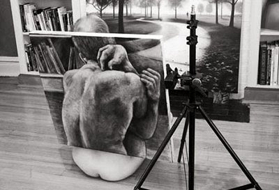
Disconcertainty (2003)
Scott's technique consist of ways to make the photograph honest and "accessibe to all audiences." For example, showing the supports for the paintings included is done intentionally so as to not conceal that they are paintings. This is to avoid the final piece from looking as if it was digitally produced or in some other way altered. All the alterations, the painting designed to open up the photograph and conceal/reveal some other detail, are meant to be out in the open and easily visible to the viewer, authentic. Also, part of the technique is choosing a title to appropriately convey the meaning, like the title "disconcertainty" of the first example, a hybrid of two words to make a word that gets the message across. I did a double take because it took me a second look to realize that wasn't a word.
The image, "Framed" is consistent with Scott's technique. A man peeks through a canvas which holds the image of another man who seems to be looking at the first. The second is an echo of the first: wearing glasses, no shirt, with short hair" and poses the chicken or the egg question. Who came first? Who is more authentic?
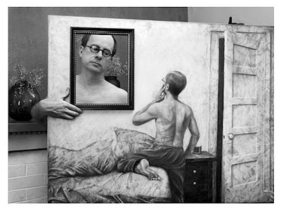 Framed (2003)
The last example is one without people in it, yet consistent with the style all the same. A misty scene of trees has a square canvas covering one section of the scene with a desolate looking tree: bland white background with a single small tree. I wonder if the painting is really covering up something behind it, or if it is making the image more lonely and desolate. While the painting seems to be simple, it adds a more barren and lonely feel to the piece.
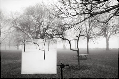
Little Tree (2003)
Gregory Scott Artist Statement
More images at the edelman gallery. Especially check out: Homage, where the tree and person fuse together, and "Poets' Graveyard" where one canvas is at an angle which makes the photo even more effective.
Photorealism (art movement of the late 1960s and early 1970s) is defined by wikipedia.org as:
"a genre of painting resembling a photograph, most recently seen in the splinter hyperrealism art movement."The movement consists of projecting a photographic slide onto a canvas to enlarge the photograph to at least ten times the original size in order to preserve accuracy and precise nature of the photograph. It is a movement sometimes compared to the "trompe de l'oeil" movement, where paintings were done in such a realistic way as to look real and three-dimensional rather than two-dimensional.
Most times, the photographs-to-paintings are made in such a way that color and imagery are emphasized using reflections or other tricky techniques that render the painting authentic and hard to replicate without technical proficiency.
Paintings From Photographs - Ralph Goings
Ralph Goings was born in 1928 in California, USA. He is known for being a realist painter, particularly from painting scenes of diners, pickup trucks, and hamburger stands from photographs. He studied at the California College of Arts and Crafts. A quote about his choice of art (from Wikipedia:Ralph Goings).
"In 1963 I wanted to start painting again but I decided I wasn't going to do abstract pictures. It occurred to me that I should go as far to the opposite as I could. ... It occurred to me that projecting and tracing the photograph instead of copying it freehand would be even more shocking. To copy a photograph literally was considered a bad thing to do. It went against all of my art school training... some people were upset by what I was doing and said 'it's not art, it can't possibly be art'. That gave me encouragement in a perverse way, because I was delighted to be doing something that was really upsetting people... I was having a hell of a lot of fun..."
 Ralph's Diner, 1982
As Edward Lucie-Smith said,
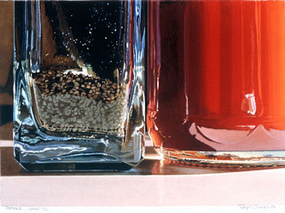
"One thing that Goings' work does have in common with photographs is its examination of light. Photography records, not objects as things in themselves, but the fall of light on objects—in other words, the way in which light is shaped by anything that interrupts its trajectory from the source."Ralph goings is fascinated by surfaces and the way that light reacts and reflects off of them. He says this is what drew him to diners in the first place, and after that to taking pictures of the details of ketchep and salt shaker bottles. I chose this image, "Pepper Detail" (1983) to show the way he takes a fraction of an object and also to see more closely the effect of this style of painting from a photograph. The lines are thick, the reflections glossy, and the effect is to take something otherwise mundane and make it interesting.

The subject matter and the style are the aspects of Going's painting that set them apart. Goings takes seemingly mundane subjects and presents them in such a way as to point out that it is worth looking at, worth considering the value of. Many paintings are those of pick-up trucks, diners, hamburger stands and others that emphasize the rolling stone nature of American life.
"Diner with Red Door" places a woman in the side of the composition in order to make her seem as just an afterthought, or just in the image by chance. The real focus is the diner, an impersonal place where people come and go.
 "Diner with Red Dorr" 1979
"Ford Overdrive" (1970)
 "Ford overdrive" 1970
All prints are found at his web page: 'Ralph Goings: Four Decades of Realism'
Photographs of Paintings - Gregory Scott
Gregory Scott's homepage, impositions, describes his medium of photographing paintings as, "photographic images of people and places with drawings and paintings." In his Gregory Scott Artist Statement he claims that he is both a painter and a photographer, and that the two for him have always been closely linked.
His style or "imposition painting" developed over a period of time, beginning with producing paintings of people very closely cropped so that sometimes body parts were missing. Later, be began to fill in these missing body parts with photographs, and this led to his current style of imposing a painting in a photograph to replace or fill in what is missing. He seeks to explore different approaches to imposing paintings into a photographic medium. The artisic ideas that he explores in his paintings include: "dimensional perception as viewed in a painting vs a photograph; the demarcations between photography and painting; perceptions of photographic truth; and introducing the artist's hand and imagination into the world of the literal photograph." He seeks to achieve emotions of "humor, play, desire, loneliness, and melancholy." He uses especially the titles to help convey meaning. For example, this photograph, entitled "Disconcertainty" is typical of Scott's style. There is a person sitting facing a painting of a road seemingly running through their living room. The torso of the person is a painting imposed on the actual subject with the brace supporting this painting clearly visible. The painting is lonely, as the figure is naked and seems to be troubled by what they see before them, which of course, is a painting. This brings up the question of what is real and what is all appearance, what to believe, and gives the painting and photography medium another dimension.

Disconcertainty (2003)
Scott's technique consist of ways to make the photograph honest and "accessibe to all audiences." For example, showing the supports for the paintings included is done intentionally so as to not conceal that they are paintings. This is to avoid the final piece from looking as if it was digitally produced or in some other way altered. All the alterations, the painting designed to open up the photograph and conceal/reveal some other detail, are meant to be out in the open and easily visible to the viewer, authentic. Also, part of the technique is choosing a title to appropriately convey the meaning, like the title "disconcertainty" of the first example, a hybrid of two words to make a word that gets the message across. I did a double take because it took me a second look to realize that wasn't a word.
The image, "Framed" is consistent with Scott's technique. A man peeks through a canvas which holds the image of another man who seems to be looking at the first. The second is an echo of the first: wearing glasses, no shirt, with short hair" and poses the chicken or the egg question. Who came first? Who is more authentic?
 Framed (2003)
The last example is one without people in it, yet consistent with the style all the same. A misty scene of trees has a square canvas covering one section of the scene with a desolate looking tree: bland white background with a single small tree. I wonder if the painting is really covering up something behind it, or if it is making the image more lonely and desolate. While the painting seems to be simple, it adds a more barren and lonely feel to the piece.

Little Tree (2003)
Gregory Scott Artist Statement
More images at the edelman gallery. Especially check out: Homage, where the tree and person fuse together, and "Poets' Graveyard" where one canvas is at an angle which makes the photo even more effective.
A Contemporary Photo (P5/Q3): Theory Notes
Composing a Shot for Effect
In order to achieve a certain effect, there are several techniques to use which make the subject or the purpose of the shot apparent. To highlight the meaning of the image, it is important to think about these things to make the shot have meaning rather than simply a photograph of something you came across.
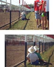
For one, when shooting an image, decide first what your main focus is going to be. Rather than seeing a nice view and taking an image decide what you want to focus on: a certain person in the scene, a hill, the sunset... In this case as demonstrated by Kodak: Composing your Pictures, the photographer has focused in on the children, eliminating all other distracting people and directing the eye towards them. This proves very effective in this case. In the first image, the picture is too general, but closing on on the two childrem along the fence achieves the effect by isolating the children. In some cases, this can be done after shooting, ie enlarging the shot in the darkroom and cropping out some information.
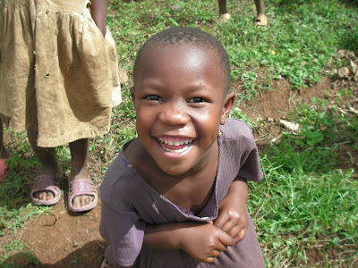
However the angle of the shot cannot be edited in. You must decide at that moment which angle highlights the subject and hence gives the desired effect. Changing the angle of the shot can usually help drastically when trying to achieve a certain effect. Taking shots from above or below standing level can change the size, and hence the importance, of the subject. For example, in Tanzania, when I was taking some shots of the children I crouched down so that I was at their eye level. The effect of this was to be able to see their faces better. Instead of looking down on children, this presented equality and made it easier to look at the children straight in their faces so as to see emotions better.
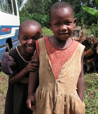
In the second example, the angle is from above, to emphasize the crouching action of the little girl.
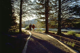
Another way to achieve a certain effect is to use leading lines to guide the eye towards a certain subject. Leading lines are those in a shot that naturally guide the eye towards the center of interest, sometimes off in the distance or closeby. In this case from Kodak, the lines of the road converge at the walking couple, drawing the eye towards them. Also, note that the righthand white stripe is diagonal. Including diagonal lines in a shot, or adjusting your angle so that these are included is a good technique to use because diagonal lines tend to make the shot more interesting and dynamic.
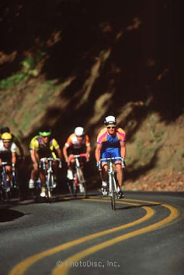
 In this example from How to Take Perfect Pictures Every Time: Leading Lines, curvy lines in a road are used to draw the eye to the cyclists - the one in the forefront in particular rather than just a group of cyclists.
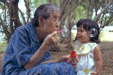
Another thing to remember when trying to achieve an effect, particularly when shooting an image of people is to let those people do their thing. Instead of posing them in a specific way, 'catching' them doing their normal or characteristic things, in other words taking a shot of them in action will yield a more meaningful image than one that is posed a certain way. In this case, from Kodak: Photographing People, a candid shot of the couple is taken which helps to achieve a lighthearted, playful effect.
In order to achieve a certain effect, there are several techniques to use which make the subject or the purpose of the shot apparent. To highlight the meaning of the image, it is important to think about these things to make the shot have meaning rather than simply a photograph of something you came across.
For one, when shooting an image, decide first what your main focus is going to be. Rather than seeing a nice view and taking an image decide what you want to focus on: a certain person in the scene, a hill, the sunset... In this case as demonstrated by Kodak: Composing your Pictures, the photographer has focused in on the children, eliminating all other distracting people and directing the eye towards them. This proves very effective in this case. In the first image, the picture is too general, but closing on on the two childrem along the fence achieves the effect by isolating the children. In some cases, this can be done after shooting, ie enlarging the shot in the darkroom and cropping out some information.

However the angle of the shot cannot be edited in. You must decide at that moment which angle highlights the subject and hence gives the desired effect. Changing the angle of the shot can usually help drastically when trying to achieve a certain effect. Taking shots from above or below standing level can change the size, and hence the importance, of the subject. For example, in Tanzania, when I was taking some shots of the children I crouched down so that I was at their eye level. The effect of this was to be able to see their faces better. Instead of looking down on children, this presented equality and made it easier to look at the children straight in their faces so as to see emotions better.

In the second example, the angle is from above, to emphasize the crouching action of the little girl.

Another way to achieve a certain effect is to use leading lines to guide the eye towards a certain subject. Leading lines are those in a shot that naturally guide the eye towards the center of interest, sometimes off in the distance or closeby. In this case from Kodak, the lines of the road converge at the walking couple, drawing the eye towards them. Also, note that the righthand white stripe is diagonal. Including diagonal lines in a shot, or adjusting your angle so that these are included is a good technique to use because diagonal lines tend to make the shot more interesting and dynamic.
 In this example from How to Take Perfect Pictures Every Time: Leading Lines, curvy lines in a road are used to draw the eye to the cyclists - the one in the forefront in particular rather than just a group of cyclists.
Another thing to remember when trying to achieve an effect, particularly when shooting an image of people is to let those people do their thing. Instead of posing them in a specific way, 'catching' them doing their normal or characteristic things, in other words taking a shot of them in action will yield a more meaningful image than one that is posed a certain way. In this case, from Kodak: Photographing People, a candid shot of the couple is taken which helps to achieve a lighthearted, playful effect.

1.17.2007
Glossy (P4/Q2): Printing Compositions
Test strip 1

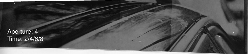
The first test strip was done at an aperture of 4 and times of 2,4,6, and 8 seconds. The image is dark, that is to say, at all of the time intervals, the areas that look like they should be white are a greyish color that only darkens overall as time increases. There are no white bits in the image, and the clarity is also really bad.
Test Strip 2, 3, 4
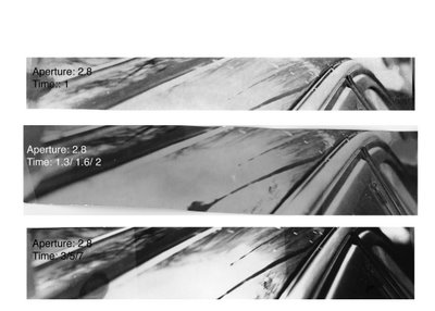 So for test strip 2, I decided to open the aperture to 2.8 and begin with a time of 1 second. This produced a print that had some white shades but lacked in black shading. It is too fair, but shows promise that with increased time, it will keep its contrast and only the dark areas will darken. I could see this in the white expanse in the lower left hand corner (out of focus) against the dark lines of where the car curves where the window meets the body of the car.
So I increased the time to 1.3, 1.6 and 2 seconds. The 3rd test strip was similar to the second, pale and washed out. But in this case it was worse, because contrast was lost as the time increased. this is shown by the fact that the white expanse that was previously, well light, is now a muddy shade of grey.
With the tip that increasing the time increases the black and whiteness of a shot, I increased the time to 3, 5, and 7 for the 4th test strip. This greatly improved the print. Now there is a large difference between the shades of black and white of the lines slanting out of the picture. The reflection of the clouds is light while the window detailing and the body of the car to the left of the reflection are quite dark. The effect of this is to make the image more balanced. Also, the black and white contrast of the image makes it more clear and visible. And now the glossiness is more perceptible as sleek black lines interrupted by reflections of clouds compose the shot.
Final Print
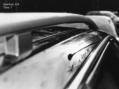
I was pleased with how the final print turned out. This one is at 7 seconds. I had tried another at 8.3 seconds just to see if increasing the time even more would make subtleties clearer (such as the cloud pattern) but it ended up not turning out better, and I chose this 7 second one. The composition is all right. There are diagonals which help to make a photo more interesting and dynamic. Also the sloping action of the top of the car and how the lines seem to run parallel to each other, yet angled out at this perspective is nice. Also the perspective is one not usually seen when you look at a car, so it is unexpected and helps to make the identity not obvious to tell. The foreground and background are out to focus which help to isolate the and highlight the lamp in the reflection as the main focus of the print.
Glossy (P4/Q2): Diary Entry
This project was a short requirement: one print that exudes the word "Gloss" in some way. We were to go to the parking lot and photograph cars, with the idea in mind of creating a compostion that showed "gloss" while keeping the exact identity of the subject hard to find out.
I focused on shooting cars with both intersing reflection and different curves and shapes of the piece of the car themself. I got a few where the bike shed was reflecting off of the hood of a car, which looked neat as the geometric slats of wood of the bike shed were warped in the surface of the car. I also got two shots that were along the top edge of the car, one with the foreground in focus and one with the middle ground in focus.
It was relatively easy to develop. The new fiber-based warmtone paper took some getting used to, but in the end worked out. I found that at the same aperture, a time of 1 second would turn out, but be grey and milky (and also take a lot of time in the developer), but a time of 7 or 8 seconds would not be too dark, would just require less developer time. In this way the print turned out more black and white. But only to a point. Since 7 seconds had improved the print so drastically, I thought that it wouldn't hurt to try the print at 8.3 seconds and try to get more detail in the foreground as well as make it more black and white. This didn't work, as the 7 second option turned out much more natural and ultimately looked better than the 8.3 second one. So to paper takes getting used to, especially cause it curls when dry, but I think that it will be good in the end for getting suficiently black and white prints.
After I was looking out for glossy parts of car in the parking lot, I found myself seeing many more things that I could have taken pictures of that were glossy, and wehre the identities would be hard to see. I made brownies that day, so I had to melt chocolate and stir with a wooden spoon and that looked especially glossy. It's just funny that once you are looking out for a certain texture or effect, you see it more in things you wouldn't expect.
Glossy (P4/Q2): Image Bank
Pierre Toutain-Dorbec "L'Enfant au Fusil
Pierre Toutain-Dorbec grew up in France, in Normandy and Paris. His family's strong artistic background led him to begin studying the arts at the age of thirteen, an all his education since then was related to the arts. At home he practiced various forms of visual arts, as well and dark-room photography. He practiced by photographing his home in Normandy and all the countryside around, and went on to study photography at a major art school in Paris.
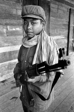
This image from Wikipedia: Pierre Toutain-Dorbec shows how something as simple as moving to the side and above the subject increases the compositional value and in this case, the meaning and impact as well. The young soldier is not photographed head on, and seems to be on the move. This leaves diagonals in the background, which is also very simple, something that enhances the composition as well. He is belittled by the angle which looks slightly down onto him, so despite the gun, he is shown as still a child. The close-up view, with the tip of hte gun very near to the camera lens makes the whole scene menacing. We are close to this child, and his gun is nearly pointed at the viewer, threateningly close. Also the expression on the child's face is hard to read, as if part of him is showing the emotion of wanting to escape and the other part feeling suspicious and superior to this intruder.
Both the subject matter and the composition contribute to giving an emotional respose to the image: a menacing solier on the move, but still a child.
Glossy (P4/Q2): Theory Notes
Composition
Composition is important in making the image appealing as a whole. Paying attention to composition can make an otherwise simple image look dynamic and interesting. Composition is composed of several elements: the angle of the shot, the framing of the shot, where the points of interest are placed, color, and contrast.
Guidelines
The Digital Photography School recommends that you ask yourself these questions when planning a composition:
More Specifically
These are just a few helpful hints. For more specific situations Digital Photography School and Photo Composition Articles give some more hints.
Fresh Angle
Instead of choosing the most obvious or sometimes the easiest angle to shoot from, consider trying something a bit different. Using a different angle can change the size of the subject (if you crouch down and shoot up, the subject looms over you and looks large) and the shading and contrast (when the sun hits the subject from a different angle). This can be achieved by lying or squatting on the ground or climbing on top of things or shooting from staircases to get above the subject.
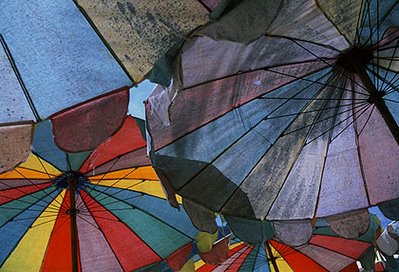 this example from Photo Composition Articles shows the importance of getting below the subject. Otherwise, this image would have consisted of several colorful umbrellas situated on a beach, but filling the frame with them and crouching to get below the umbrellas for a unique perspective makes the photo more interesting.
Filling the Frame: Cropping
Cropping is important to do. When you are shooting an image, pay attention to what really belongs in the viewfinder and do not always count on cropping in the darkroom or on the computer. Instead of letting distracting things in the background compete with the subject for attention, declutter and get in close to the subject. Also sometimes filling the frame with the subject eliminates the possibility of something unwanted (like an ugly sign) entering into the frame. Other times, filling the frame gets rid of useless space that surrounds the subject and doesn't add anything interesting, and lets you focus in to detail. Oftentimes we do not need as much 'context' or setting in the background, zooming in will still allow some background and the place where the subject is can still be determined.
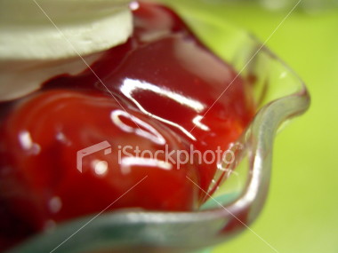
iStockPhoto provides an example of this that greatly increases the compositional value of the image. These strawberries look enticing and almost unidentifiable, something that this project on gloss strove to do.
Perspective and Dimensions
Instead of having landscapes and photos of people look one dimensional, try to think of ways to make the photo more alive. For example, when photographing a landscape, keep something in the foreground to give the sense of really being in that place at that time. When photographing a person, have them in action, or holding something towards you, in order to make them seem more alive. Also consider having movement or action in the image rather than standing still. Add something in the foreground or use depth of field and aperture tricks to set the subject apart from the wall.
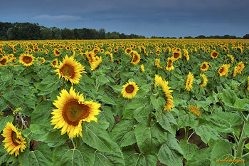
The Digital Photography School provides an example of how adding foreground (achieved by kneeling) makes a scene more alive ad 3 dimensional than it would have looked if it were just a field of sunflowers and a line of trees all of uniform size.
To Sum Up
These are just some of the things that you can look to change to improve composition. The jist of it is to try to find a new angle or a more dynamic way to look at a scene. Usually, this is not found at eye level right when you walk up to something. As subjects and scenes cannot always be moved, you as the photographer have to move, horizontally and vertically to get a different view of something.
Composition is important in making the image appealing as a whole. Paying attention to composition can make an otherwise simple image look dynamic and interesting. Composition is composed of several elements: the angle of the shot, the framing of the shot, where the points of interest are placed, color, and contrast.
Guidelines
The Digital Photography School recommends that you ask yourself these questions when planning a composition:
• What is the subject of this photo?
• Is there more than one subject? If so would it be better to capture them with multiple shots?
• What is the mood of the moment?
• What is going on in the background of this shot?
• Do I have time to pose my subject (and is it appropriate to do so) or do I need to shoot fast?
• Is the place I’m shooting in light or dark?
• Who else is taking photos of this subject? What angles are they taking shots from (sometimes they can give you ideas of what shots to take and sometimes they can give you hints as to what images EVERYONE is taking and inspire you to do something different)?
• Is my subject moving or still?
• Are there any patterns in the photo that I could work with?
More Specifically
These are just a few helpful hints. For more specific situations Digital Photography School and Photo Composition Articles give some more hints.
Fresh Angle
Instead of choosing the most obvious or sometimes the easiest angle to shoot from, consider trying something a bit different. Using a different angle can change the size of the subject (if you crouch down and shoot up, the subject looms over you and looks large) and the shading and contrast (when the sun hits the subject from a different angle). This can be achieved by lying or squatting on the ground or climbing on top of things or shooting from staircases to get above the subject.
 this example from Photo Composition Articles shows the importance of getting below the subject. Otherwise, this image would have consisted of several colorful umbrellas situated on a beach, but filling the frame with them and crouching to get below the umbrellas for a unique perspective makes the photo more interesting.
Filling the Frame: Cropping
Cropping is important to do. When you are shooting an image, pay attention to what really belongs in the viewfinder and do not always count on cropping in the darkroom or on the computer. Instead of letting distracting things in the background compete with the subject for attention, declutter and get in close to the subject. Also sometimes filling the frame with the subject eliminates the possibility of something unwanted (like an ugly sign) entering into the frame. Other times, filling the frame gets rid of useless space that surrounds the subject and doesn't add anything interesting, and lets you focus in to detail. Oftentimes we do not need as much 'context' or setting in the background, zooming in will still allow some background and the place where the subject is can still be determined.
iStockPhoto provides an example of this that greatly increases the compositional value of the image. These strawberries look enticing and almost unidentifiable, something that this project on gloss strove to do.

Perspective and Dimensions
Instead of having landscapes and photos of people look one dimensional, try to think of ways to make the photo more alive. For example, when photographing a landscape, keep something in the foreground to give the sense of really being in that place at that time. When photographing a person, have them in action, or holding something towards you, in order to make them seem more alive. Also consider having movement or action in the image rather than standing still. Add something in the foreground or use depth of field and aperture tricks to set the subject apart from the wall.
The Digital Photography School provides an example of how adding foreground (achieved by kneeling) makes a scene more alive ad 3 dimensional than it would have looked if it were just a field of sunflowers and a line of trees all of uniform size.

To Sum Up
These are just some of the things that you can look to change to improve composition. The jist of it is to try to find a new angle or a more dynamic way to look at a scene. Usually, this is not found at eye level right when you walk up to something. As subjects and scenes cannot always be moved, you as the photographer have to move, horizontally and vertically to get a different view of something.
Subscribe to:
Posts (Atom)